Some B&W's to Share

freixas

No longer a newbie, moving up!
Joined
Jun 11, 2010
Messages
132
Reaction score
29
Location
Portland, Oregon
Can others edit my Photos
Photos NOT OK to edit
Hi,

I've been taking doing photography for a long time. Occasionally, I challenge myself to take photos outside my comfort zone. I'm presenting a few of these here and would love to hear your thoughts. I'm less interested in knowing whether you like or dislike these as I am in knowing why you like/dislike them. I myself don't think that any of these is flawless, but I do find them all interesting.

IMG_1517.jpg


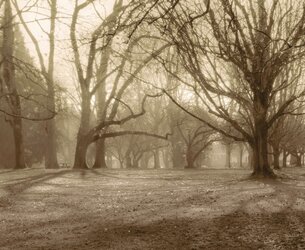
Reed College Great Lawn, Winter.
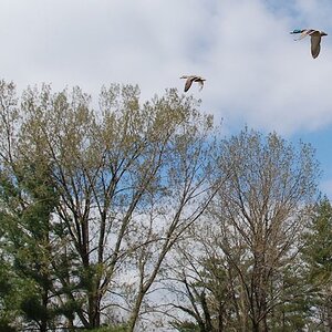
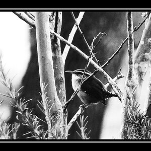
IMG_1518.jpg


Trees with Crow.

IMG_1562.jpg


Leeks for Sale.

IMG_1578-as-Smart-Object-1.jpg


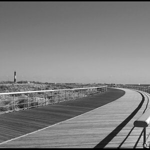
Pioneer Courthouse Square, Portland, OR.
 
The monochrome treatment to the upper two might be o.k., but the bottom two probably should have been left in color.
 
B&W tends to look better with blacker blacks and whiter whites.
A little crop and some changes to the curve adding contrast

Actually, I agree with the comments on contrast. But I had a problem with the effect higher contrast had on the leeks and it shows up on your version as well (it's not just because you had a lower-quality image to start from). I tried various approaches and never got a result I was happy with.

Although I don't care for your crop, it does "highlight" (pun, get it?) the problems with the upper-left box. I don't know how I missed the washed out highlights there; probably because I was paying too much attention elsewhere. Thanks!

I remain intrigued by this photo, probably because of the composition and textures, but it probably needs to go into my "better luck next time" pile.

Thanks for your time!
 
The monochrome treatment to the upper two might be o.k., but the bottom two probably should have been left in color.

OK. Why? I'm not saying I agree or disagree. I can even think of some reasons why you might say that, but I'd rather not assume anything.
 
The monochrome treatment to the upper two might be o.k., but the bottom two probably should have been left in color.

OK. Why? I'm not saying I agree or disagree. I can even think of some reasons why you might say that, but I'd rather not assume anything.
Some subject material is inherently more well-suited to monochrome, and others to color. In the foggy forest scene; I will guess that the colors are muted already, so going with monochrome did not hurt it and perhaps helped it.

The tree against the sky (please number your shots) also is basically two (main) colors, so wiping out all color does not hurt it. What really hurts it is having the crow so near the edge that it is nearly out of the frame entirely. That little spot of dark draws one's eye.

The leeks in boxes have a good color contrast and range of colors, and as such would be a very beautiful photo in color.

Same for the street scene.
 
This is just personal, but the only one I find remotely interesting is the first one. To me, the composition just doesn't capture my attention in the other 3, whether they were color or BW. The last one has no clear subject. You cut most of the legs off the nearest person and everything else just seems to be haphazardly in the scene. The second is just uninteresting limbs on a tree that have no special significance. The placement of the bird does nothing. I could not tell that those were leeks as I do not see the bulbs. Again, these are all just personal observations. I am not a professional nor do I ever intend to be, so my opinion only matters to me, lol.
 
Some subject material is inherently more well-suited to monochrome, and others to color. In the foggy forest scene; I will guess that the colors are muted already, so going with monochrome did not hurt it and perhaps helped it.

The question as to what makes a good B&W vs. color shot is an interesting one. I started with B&W many moons ago. I'm working more in color now. Some shots clearly work better one way than another; some shots result in spectacular images either way. I'm not sure I would use muted colors as the criteria for going to B&W, but I'm happy to hear the criteria people used to decide.

Thanks for taking the time to explain!
 
This is just personal, but the only one I find remotely interesting is the first one. To me, the composition just doesn't capture my attention in the other 3, whether they were color or BW. The last one has no clear subject. You cut most of the legs off the nearest person and everything else just seems to be haphazardly in the scene. The second is just uninteresting limbs on a tree that have no special significance. The placement of the bird does nothing. I could not tell that those were leeks as I do not see the bulbs. Again, these are all just personal observations. I am not a professional nor do I ever intend to be, so my opinion only matters to me, lol.

I appreciate your observations and your time.
 
I'm not sure I would use muted colors as the criteria for going to B&W,
I have failed again. :(

To adequately explain something.

Contrary to what you think I wrote, I use many criteria to decide if a shot would benefit from a monochrome conversion.
 
I'm not sure I would use muted colors as the criteria for going to B&W,
I have failed again. :(

To adequately explain something.

Contrary to what you think I wrote, I use many criteria to decide if a shot would benefit from a monochrome conversion.

Hey, no biggie. I would ask you what your criteria are except that I would expect the answer to be "It depends..." Also, it would be unfair to ask you to elaborate further as I have not posted the original color versions of the images for you to evaluate.
 
Hey, no biggie. I would ask you what your criteria are except that I would expect the answer to be "It depends..."
You're coming off as being very antagonistic, and for no good reason.

My answer to your question:

The usual; line, form, texture, chiaroscuro, value variation, and possibly others.
 
I like the first one except for the black tree on the right. It detracts and pulls my eyes away from the soft main subject of the trees in the background. If you moved up before taking the shot you would have eliminated the dark tree. I would still keep the shadows in front of the trees.
 
I like the first one except for the black tree on the right. It detracts and pulls my eyes away from the soft main subject of the trees in the background. If you moved up before taking the shot you would have eliminated the dark tree. I would still keep the shadows in front of the trees.

Thanks, Alan!
 

Most reactions

New Topics

Back
Top