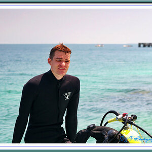
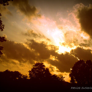
1. A nice silhouette, and I like the glow on her hair, but the blown area from the sun image left and the pole are very distracting. I think this would have been a much stronger image if were composed such that the land going across the image at her neck-level weren't there, but just a tighter crop on her head/shoulders would improve things significantly.
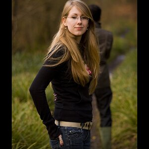
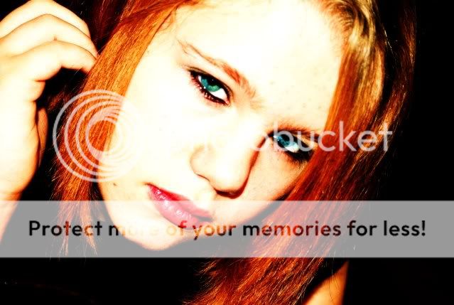
2. Good work on the exposure here; you've got some over-bright areas on her forearm shirt-front, but not too bad. I assume the artifacting is simply a result of compression?
3, 4. Not really fond of either of these. They are far too high-key for my taste, looking like a single, too-strong on-camera flash was used. The detail is washed out her skin in large areas.
Overall, some good work, but with room for improvment. Keep at it, and don't forget to level your images in post.
#1. I like the silhouette, but her elbow is hyperextended and looks odd.
#2. The perspective on her arm looks...wonky. That's the only word I can think of. Its a nice shot, but I think having her facing at a three-quarters angle would make this stronger.
#3. Nothing interesting about this shot, and over edited.
#4. Is okay, but not really interesting, and highly over edited.
The silhouetted idea in the top picture is a nice idea...you can see her bust line, which instantly conveys femininity, but we cannot see her chin and neck lines clearly due to an overlap with the background, so you are missing one of the strongest "human" factors, the face/neck 'gestalt', for lack of a better word in English. If you would have dropped the camera a few inches her silhouetted form would have been much more powerful. I agree that the hyperextended elbow looks a bit off too. Points for trying and recognizing a silhouette op though!
The second picture is a god idea, but the overexposure on the hand near the camera kind of bugs me. The posterized tones in the sky look a bit weird, but the overall effect is graphic,and I understand what you were trying to achieve.
Number three is a non-starter for me. Shot four has good eye contact, but seems very overexposed and the shot's not too successful from my point of view.
The second picture is a god idea, but the overexposure on the hand near the camera kind of bugs me. The posterized tones in the sky look a bit weird, but the overall effect is graphic,and I understand what you were trying to achieve.


![[No title]](/data/xfmg/thumbnail/37/37102-ef61523dcb48f0bd3a761c8bb5cea767.jpg?1619737881)