For in-depth critique I would much rather see one photo per thread.
1. Vertical subjects should be framed vertically, and speaking of vertical, straighten any and all photos.
2. Framing shrub is trying to take over the shot. Less shrub, more house.
3. I'm not a very good judge of macro, which I assume this is, but it's framed fairly well.
#1 - There is a lot of negative space to the left. Like Designer said, framed vertically might look nicer. Also, the upper half of the steeple(?) is pretty dark. Maybe try again when it's a little lighter outside, just after sunset?
#2 - Agree. There is too much shrub in the photo. Just a tad less.
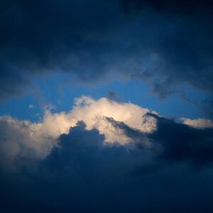
#3 - There is something I dislike about the photo, but I can't figure it out. Maybe it needs more detail and less processing? Some of the darks are too dark. There's a fingerprint that's pretty evident that I can't stop looking at. Also, I feel like it should be flipped, with it pointing to the right. Maybe it's personal preference, but I'd rather see the negative space to the right.
I agree with the previous comments. On the last one, I think there is too much empty space and this would be better as a square crop (preferably with more highlight detail). You'll get a lot of different opinions on cropping here, so you'll have to decide what works for you.