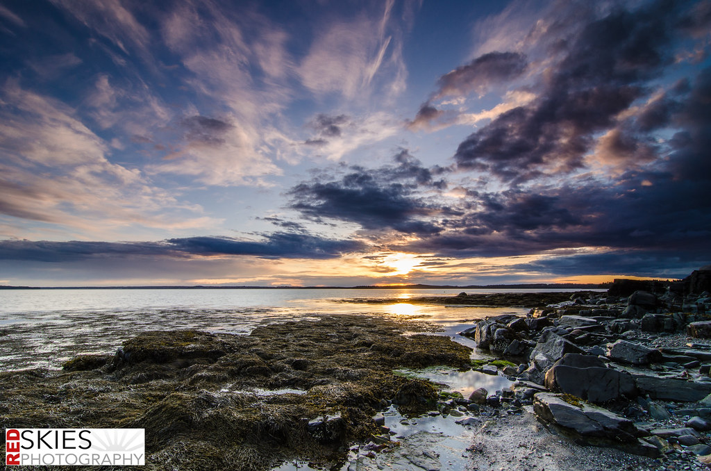
I commented in your other thread about the logo you put on the photos. Just look at runnah's suggestions and see the difference between his and your fonts f.e.
And why did you chose the white background?
I wanted it to "stand out" a bit. But not be excessive.
But when a viewer have a white box in the left corner of an sunset (beautiful toned down colors) all their eyes will see is the white box in the lower left corner.
Eyes are first seeing the brightest part of a photograph and the area with the most contrast. You have both in this logo.
You don't want the logo to be the main part of your photograph.
")