Interesting place, very busy visually, rich in regular geometric shapes. However there is not enough light in there, not enough value separation, things are "walking" into each other, three dimensional feel is almost lost.
Processing is too heavy in my opinion, this subject needs more of zone system spirit.
Aldo I have to admit, that on my better screen picture looks better. A bit better tonal separation
But still there is that "flatness" of view. Maybe it is that total sharpness, absolute DoF.
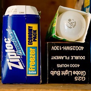
I agree with the potential of the shapes and textures, but the globe gets lost in the background. I would have tried getting lower, pushing the globe up into the sky a little and giving it some separation.

![[No title]](/data/xfmg/thumbnail/33/33023-51777cffdd160249e68e593d19942418.jpg?1619735835)

![[No title]](/data/xfmg/thumbnail/34/34123-da7d55491fec06595061191321c92646.jpg?1619736293)