Victor

jeytee

TPF Noob!
Joined
Feb 22, 2016
Messages
67
Reaction score
28
Can others edit my Photos
Photos OK to edit
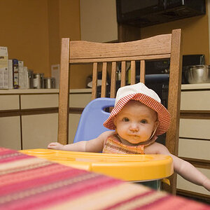
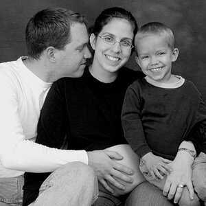
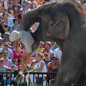
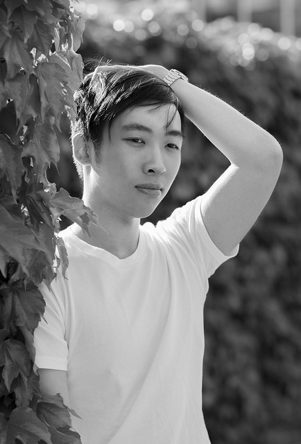
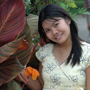
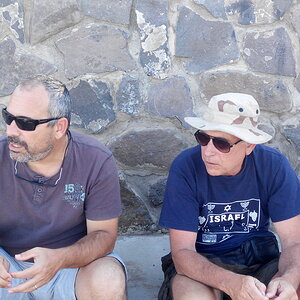
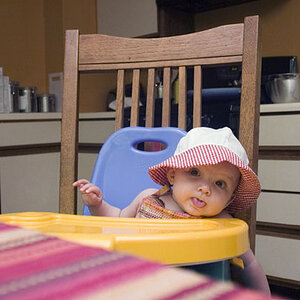
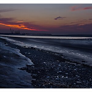
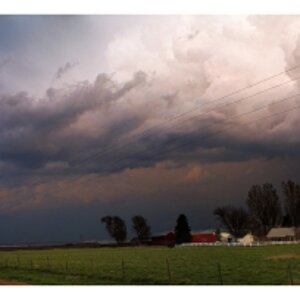
Looking for some critique on a couple pictures from a recent photoshoot I did with a friend.
I'm thinking I should add a bit more space above the head in PP in the 1st one? And maybe clone out the really bright highlights in the 2nd one?

1.
35027503645_0964cae65d_z.jpg


2.
34640733350_31acb3a89d_c.jpg


3.


4.

[url=https://flic.kr/p/Vq3X2M]
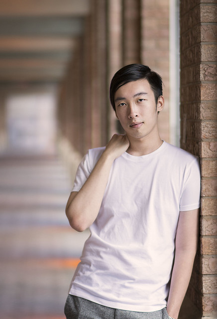
[/url]
 
Last edited:
I would agree with, "more space above his head", though, as-is, it's not unbearable. In #2, my main concern is the lack of detail in his hair, the darkness of his eyes, and the general under-exposure on his face. I'm guessing you didn't bother with any sort of fill light?
 
I would agree with, "more space above his head", though, as-is, it's not unbearable. In #2, my main concern is the lack of detail in his hair, the darkness of his eyes, and the general under-exposure on his face. I'm guessing you didn't bother with any sort of fill light?
Yeah I didn't use any fill, but I see how much I needed it. I actually do own a reflector and an external flash but I just didn't bring it with me. How do you recommend filling this picture in properly? Like what type of fill light? (Also if it is just 2 people at a shoot- model and photographer). Thanks!
 
I think the first is very nice and any small defects can be fixed.
After adding some at the top and left so that any space is behind him and he's not against the top margin., I added to the top of his head with a softish clone stamp tool (~75)
Lowered the highlights - specially his shirt, dodged/burned his hair, warmed the entire things and increased saturation a bit.

The second is too flat to camera and without connection for my taste.

upload_2017-6-1_12-48-35.png
 
I would agree with, "more space above his head", though, as-is, it's not unbearable. In #2, my main concern is the lack of detail in his hair, the darkness of his eyes, and the general under-exposure on his face. I'm guessing you didn't bother with any sort of fill light?
Yeah I didn't use any fill, but I see how much I needed it. I actually do own a reflector and an external flash but I just didn't bring it with me. How do you recommend filling this picture in properly? Like what type of fill light? (Also if it is just 2 people at a shoot- model and photographer). Thanks!
If you're planning to use external flash or a reflector for fill, it may be in your best interest to start getting your friends to assist you on photo shoots. I personally hate shooting without an assistant as I prefer to have a white reflector whenever possible. As far as placement goes for the reflector it really depends on the effect you want, but for the most part I position a white reflector from below to reflect light up into the eye sockets and generally make sure that it's creating additional catch-lights in the bottom of the eye balls. The result looks like this:
screen_shot_2017_06_01_at_8_49_00_pm_by_danostergren-dbb8w6p.png


Those catch-lights are important; they give life to the eyes and bring out detail in the iris. You can manipulate the shape of the catch lights as well if you're using a collapsible reflector by bending it. I like the look of square catch-lights though, so I picked up a cheap piece of white foam display board at Walmart for $2, and it works perfectly.


As for critique, I like your lighting in both photos; you do a nice job using the light to sculpt the model's features and give the image more dimension. I do agree that some fill light would bring in some more detail to important areas on both of these, particularly the hair as tirediron pointed out. Did you lose detail in the hair after editing it, or was it from your light? If it was editing, I would suggest going back in and bringing some detail back to the hair by reducing the intensity of your black tones. The awkward posing in the first shot would cause me to cut that one from the final edits. The body positioning creates a clunky rectangle in the image composition, and the right arm (camera left) positioning makes him look a bit like he has a gimpy arm with no upper segment to it; just barely raising his elbow up and a bit to the side would fix that arm issue, and having him separate his left elbow (camera right) from the side of his body so that there is a separation between the elbow and his torso would break up the clunky rectangular shape . When you're posing anyone, you want to consider the shapes that you're creating with the arms and body. Triangular shapes are particularly flattering for men, so try making adjustments in the posing that break up the body and create shapes to enhance your composition. Having your model stand square to the camera with his arms down to his side and no separation between the arms and body usually doesn't work for anyone. Even having him simply stick his elbows out just a little bit can make a huge difference. Here's another example:
screen_shot_2017_06_01_at_9_02_34_pm_by_danostergren-dbb8xkg.png
 
his expression is kinda meh.
there is no liveliness in it.
the lighting in image #2 is kinda just wrong.
not bright enough and feels greyish and the lack of catchlights make him look dead.
 
his expression is kinda meh.
there is no liveliness in it.
the lighting in image #2 is kinda just wrong.
not bright enough and feels greyish and the lack of catchlights make him look dead.
I personally don't see what's wrong with the lighting in 2. It hits all of the highlight points that a makeup artist would highlight if they were contouring and highlighting him.

Just feels grey and dull
 
I think the first is very nice and any small defects can be fixed.

After adding some at the top and left so that any space is behind him and he's not against the top margin., I added to the top of his head with a softish clone stamp tool (~75)

Lowered the highlights - specially his shirt, dodged/burned his hair, warmed the entire things and increased saturation a bit.


The second is too flat to camera and without connection for my taste.


View attachment 140828

Thanks for taking the time to make an example edit! I like alot of those changes. I went back and changed stuff following your guideline~

And yeah the 2nd one is plain looking when I look at it now.

Thanks for the feedback!

I'm going to post some of the other pictures I took so I'd appreciate any critique on them if you happen to have the chance too.

 
his expression is kinda meh.
there is no liveliness in it.
the lighting in image #2 is kinda just wrong.
not bright enough and feels greyish and the lack of catchlights make him look dead.
I personally don't see what's wrong with the lighting in 2. It hits all of the highlight points that a makeup artist would highlight if they were contouring and highlighting him.

Just feels grey and dull
That could be easily fixed in post, but I don't think it's bad lighting at all.
 
If you're planning to use external flash or a reflector for fill, it may be in your best interest to start getting your friends to assist you on photo shoots. I personally hate shooting without an assistant as I prefer to have a white reflector whenever possible. As far as placement goes for the reflector it really depends on the effect you want, but for the most part I position a white reflector from below to reflect light up into the eye sockets and generally make sure that it's creating additional catch-lights in the bottom of the eye balls. The result looks like this:

clip_image001.png


Those catch-lights are important; they give life to the eyes and bring out detail in the iris. You can manipulate the shape of the catch lights as well if you're using a collapsible reflector by bending it. I like the look of square catch-lights though, so I picked up a cheap piece of white foam display board at Walmart for $2, and it works perfectly.


As for critique, I like your lighting in both photos; you do a nice job using the light to sculpt the model's features and give the image more dimension. I do agree that some fill light would bring in some more detail to important areas on both of these, particularly the hair as tirediron pointed out. Did you lose detail in the hair after editing it, or was it from your light? If it was editing, I would suggest going back in and bringing some detail back to the hair by reducing the intensity of your black tones. The awkward posing in the first shot would cause me to cut that one from the final edits. The body positioning creates a clunky rectangle in the image composition, and the right arm (camera left) positioning makes him look a bit like he has a gimpy arm with no upper segment to it; just barely raising his elbow up and a bit to the side would fix that arm issue, and having him separate his left elbow (camera right) from the side of his body so that there is a separation between the elbow and his torso would break up the clunky rectangular shape . When you're posing anyone, you want to consider the shapes that you're creating with the arms and body. Triangular shapes are particularly flattering for men, so try making adjustments in the posing that break up the body and create shapes to enhance your composition. Having your model stand square to the camera with his arms down to his side and no separation between the arms and body usually doesn't work for anyone. Even having him simply stick his elbows out just a little bit can make a huge difference. Here's another example:

clip_image002.png

Omg thanks for the critique! I may or may not have been following your work secretly for a while haha. Your work is just so awesome and I don’t find that many male predominant photographers so its hard for me to get tips when I shoot with my male friends.

I really appreciate the fleshed out critique you did. It really helps for someone to explain it to me rather than tell me only what I did wrong (although I should get better with Google maybe lol).

I agree with the catchlights. I do own a foldable reflector, but I don't usually bring it just bc its impossible to use it with only 2 people if there's wind.


I think I lost detail in the hair from both tbh and I’ll have to go back and take a look later on.


And yeah the pose is awkward now that I look at it and looks really weird. Okay so triangular shapes- got it. I do have a couple pictures where I tried to direct him more and I think I did hit some of the points you brought up (without knowing it lul). Please take a look at them and tell me what you think if you have the time.


(Hand kinda is mashed against his neck tho)

 
his expression is kinda meh.
there is no liveliness in it.
the lighting in image #2 is kinda just wrong.
not bright enough and feels greyish and the lack of catchlights make him look dead.
Thanks for the feedback!
Yeah my friend did note he didn't like his expression in the photos.
Any tips on getting good expression from your model?
Also take a look at the other pictures I posted and let me know your thoughts.
 
If you're planning to use external flash or a reflector for fill, it may be in your best interest to start getting your friends to assist you on photo shoots. I personally hate shooting without an assistant as I prefer to have a white reflector whenever possible. As far as placement goes for the reflector it really depends on the effect you want, but for the most part I position a white reflector from below to reflect light up into the eye sockets and generally make sure that it's creating additional catch-lights in the bottom of the eye balls. The result looks like this:

clip_image001.png


Those catch-lights are important; they give life to the eyes and bring out detail in the iris. You can manipulate the shape of the catch lights as well if you're using a collapsible reflector by bending it. I like the look of square catch-lights though, so I picked up a cheap piece of white foam display board at Walmart for $2, and it works perfectly.


As for critique, I like your lighting in both photos; you do a nice job using the light to sculpt the model's features and give the image more dimension. I do agree that some fill light would bring in some more detail to important areas on both of these, particularly the hair as tirediron pointed out. Did you lose detail in the hair after editing it, or was it from your light? If it was editing, I would suggest going back in and bringing some detail back to the hair by reducing the intensity of your black tones. The awkward posing in the first shot would cause me to cut that one from the final edits. The body positioning creates a clunky rectangle in the image composition, and the right arm (camera left) positioning makes him look a bit like he has a gimpy arm with no upper segment to it; just barely raising his elbow up and a bit to the side would fix that arm issue, and having him separate his left elbow (camera right) from the side of his body so that there is a separation between the elbow and his torso would break up the clunky rectangular shape . When you're posing anyone, you want to consider the shapes that you're creating with the arms and body. Triangular shapes are particularly flattering for men, so try making adjustments in the posing that break up the body and create shapes to enhance your composition. Having your model stand square to the camera with his arms down to his side and no separation between the arms and body usually doesn't work for anyone. Even having him simply stick his elbows out just a little bit can make a huge difference. Here's another example:

clip_image002.png

Omg thanks for the critique! I may or may not have been following your work secretly for a while haha. Your work is just so awesome and I don’t find that many male predominant photographers so its hard for me to get tips when I shoot with my male friends.

I really appreciate the fleshed out critique you did. It really helps for someone to explain it to me rather than tell me only what I did wrong (although I should get better with Google maybe lol).

I agree with the catchlights. I do own a foldable reflector, but I don't usually bring it just bc its impossible to use it with only 2 people if there's wind.


I think I lost detail in the hair from both tbh and I’ll have to go back and take a look later on.


And yeah the pose is awkward now that I look at it and looks really weird. Okay so triangular shapes- got it. I do have a couple pictures where I tried to direct him more and I think I did hit some of the points you brought up (without knowing it lul). Please take a look at them and tell me what you think if you have the time.


(Hand kinda is mashed against his neck tho)

Thank you!
These are much better. I like your lighting, his expressions and general body language are better, and the editing is very clean. The first has a similar pose as the one from your original post, but I'm able to decipher that there is both a forearm and arm section, which is good. It's a detail that I miss sometimes, but try not to have your model put there entire hand in their pocket if you can (I know I posted an example before that contradicts this lol), and instead have him just hook his thumb into his pocket. Also, catch lights are nice, but don't let anyone lead you to believe that a photo is bad without them; it's case-by-case, not a formula that you are required to follow. I notice there are no catch lights in the eyes of the two additional shots you just shared (or they're just very subtle), but the lack of catch lights certainly don't make him look dead, however it's likely that catch lights would still improve the images. If you're doing headshots, you can also have your model hold the reflector if you don't have an assistant. I do this all the time.
Google isn't going to give you all of the answers you need, at least not easily. It helps to have someone point you in the right direction. Last year photographer Jeff Rojas released a book called "Photographing Men", as well as a course on Creativelive called "Men's Portrait Photography", both of which I highly recommend. If you get the book, buy it off of Amazon because it's MUCH cheaper than buying it from a retailer like Powell's or Barnes and Noble. It has lot's of great written information as well as some incredible visual reference; he really knows what he's doing. He also recently released a book called "Photographing Women", and if it's anywhere as good as his first book, I would check that one out too. Jeff Rojas is a reeeaaally great photographer worth checking out.
 
Last edited:
his expression is kinda meh.
there is no liveliness in it.
the lighting in image #2 is kinda just wrong.
not bright enough and feels greyish and the lack of catchlights make him look dead.
Thanks for the feedback!
Yeah my friend did note he didn't like his expression in the photos.
Any tips on getting good expression from your model?
Also take a look at the other pictures I posted and let me know your thoughts.
concentrate on connecting and putting the subject at ease before even taking out your camera
 

Most reactions

Back
Top