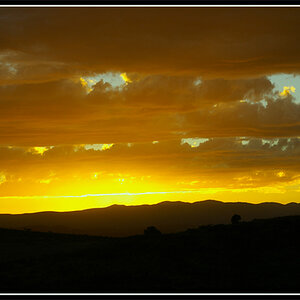
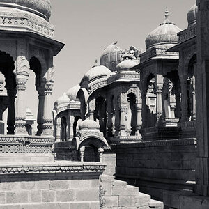
website evolution #1

THORHAMMER

No longer a newbie, moving up!
Joined
Dec 24, 2005
Messages
2,789
Reaction score
8
finally the site has gone through its first stage of evolution. Looks a lot better then it did.

Just hard to get time to update it when you are busy shooting !!!

Lightroom had a big part im me being able to sort through 15000 + images in a few hours to pick out master raw files... !!! yay for lightroom...

Ill be getting some studio space in a month , hopefull ill be able to come up to speed in my studio work and snag a few clients !! Wish me luck...

-dave (thorhammer)

http://www.uniqimage.com/
 
Not so much a fan of the logo, I'd rather see a nicely done static one, than something animated

The gallery (from the Clients page) makes no sense to me. The slideshow looks like it's still at default. What is Current Exhibit? What are 1, 2, 3, etc for? I see they show different images, but 1 is Limited Edition, and 4 says Pricing / Packages. I'd go for categories over just numbers, something that actually differentiates and tells us what we're looking at

Oh and whatever that plus and minus are supposed to do is beyond me ;)

You should also try integrating the gallery into the site so we don't lose the gallery's navigation while searching through (again from the Clients page)

Your Weddings gallery doesn't jive at all with the rest of the site, you should try integrating it so the site stays consistent, then if you really want flash, find something without a blue and yellow preloader and blue buttons as they don't match your color scheme

The Portrait gallery's done better, but for all your gallerys I'd try laying out the images nicer than just however many fit on a line, aim for a consistent number images on a line

About, Services, and Contact are done very well though, nicely laid out too

Hope that helps some
 
Sorry... I was a proofreader in a former life. Forgive me.

But in "Now Capturing Timeless Wedding's, Visit the Wedding Gallery."... Wedding's shouldn't have an apostrophe.

As I write that it occurs to me... what exactly is a timeless wedding? I might rework that slogan.
 
thanks guys, I totally AGREE !!!! yay..

yeah, that original navigation is something I was playing with and didnt toally take it out of all the pages.. consider that gone , also I know about the gallery structure, I need to give them border padding and decent spacing, I was trying to fit them all onto one page, but its not so good I dont think....

Thanks, I just need to polish it up, I think Im going to drop everything but the wedding stuff... its going to have a rework very soon !!!! good catch about the apostrophe!!! thanks
 
I clicked on Weddings, and the navigation was different. No links across the top, but different links across the bottom. It's kinda confusing; navigation to the home page should be consistent throughout the site. The photos were great, though!

I also went to Clients and clicked the first one (Diesel) and the website could not be found...
 
thanks again !!

I decided I am going to just concentrate on weddings adn portraits and
hide everything else on a subpage of the site I can still link to
it if I want to show, but I want to concentrate on weddings
and maybye get more into commercial later in the future.
Youll see a major change on it prob friday, or saturday, ill
send a link.

I took out the header of the slideshow page because I
didnt know if people would eb smart enough to scroll down
to view the whole slideshow window (you never know)

But maybye im worrying about nothing....

Yeah a few designers I was working with who worked with diesel
and vodka( just on conceptual stuff )couldnt get the ok to legally allow us to link to them... I think its a PR thing, they only want other corporations
like themselves to link to them....

the mockups werent all that great to shoot, but I learned a
lot doing it and the name sounds good on the site.. lol
If I could just get that guy to send me the tearsheets
(Although I think they scrapped the idea of coconut flavor
altogether. so diggin up the tearsheet might be a no-no for the
designer.... )
 

Most reactions

New Topics

Back
Top