Although it doesnt follow the 1/3 rule, I love the first one. It works. The cityscape is nice too.. If you want people to CC your pictures, put numbers on them.
Although it doesnt follow the 1/3 rule, I love the first one. It works. The cityscape is nice too.. If you want people to CC your pictures, put numbers on them.
Thanks, numbers do make it easier. I should add that most of my photos tend to be "computer wallpaper photos". At least that's what I think of them as. Don't ask me why, I just like the "computer background" style of images. Strange, I know.
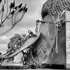
1. I quite like this, not a fan of colour photographs in general, I'm more of a B&W kinda guy,..however, the sky is great, the focus is nice and sharp. A good stock photo in my opinion.
2. Doesn't do much for me, but the left hand side of the photo has some great colours going on, the sun has a neat sort of half halo underneath it, but other than that it has a sort of thrift shop instamatic 'point and shoot' look about it to me. Doesn't light any fires for me.
3. Best thing about this is the sky, it's very dramatic,... in fact I think the statue of liberty sort of ruins the picture slightly, love the greys and golds in the sky.
4. If the top of the flag hadn't been cut off I'd say it was good 'wallpaper' picture for people who do like golf, And maybe a ball with no writing on it would be better suited.
5. Focus looks a little soft, but the exposure is good. This kind of picture does nothing for me, but it is well executed.
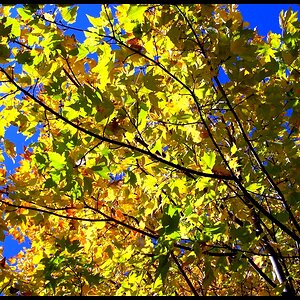
6. I don't know where to look, the leaves have lovely sharp focus, but they're boring, and the background is so blurred out that it's not interesting to look at, nor does it grab your attention. underwhelming.
Thanks very much for the comments. Yes, number 5 was taken without a tripod. Instead, I rested the camera on a cement wall and used my case to prop up the lens. I completely understand what you mean for number 2 and 6. I know there's nothing spectacular about them; they are just pictures that I enjoy. For instance, I love the colors in number 2, also the simplicity demonstrated by the lone cargo ship at sea. Number 6 simply reminds me of a very memorable trip I took. Nothing special
I actually did a lot of editing in number 3. Not for the colors (they were pretty much there already) but for the horizon. There were LOADS of cranes, poles, and I-don't-know-whats that were sticking up everywhere. It was very distracting. I spent a lot of time removing them to make it look as clean as possible with only the Statue and the flag standing out.


")
![[No title]](/data/xfmg/thumbnail/40/40414-0d191cae467ae156374e5d8744c94b85.jpg?1619739465)

![[No title]](/data/xfmg/thumbnail/39/39491-353a6df9b207e97dadcdce4f98248fcd.jpg?1619739051)