York Revisited in High Contrast B/W

cigrainger

TPF Noob!
Joined
Feb 2, 2007
Messages
480
Reaction score
1
Website
www.flickr.com
Can others edit my Photos
Photos NOT OK to edit
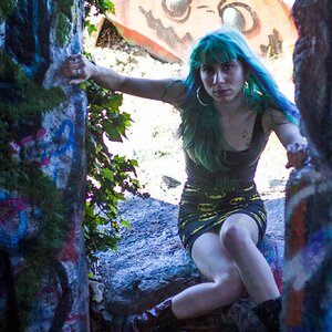
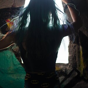
What do you think? I was trying to capture a heavy, apocalyptic feel.

1.
IMGP1210.jpg


2.
IMGP1146.jpg


3.
IMGP1168.jpg


4.
IMGP1151.jpg


5.
IMGP1139.jpg
 
1) I think the sky has potential to work well with the wall, but not from this angle with those people where they are. I would have looked for a better angle.

2) I think it's a cool shot for sure. Good idea (infact i did one very similar this week when i went out) and the on thing that you could do to make it even better for me, is probably not possible. I think the actual wall isn't straight, as the verticles are straight, but the horizontals are slanted.
Otherwise, interesting shot :)

3) Not sure what you were aiming for, but you've kinda just sliced the building at any old angle.
Once again, select the part that you wish to photograph and get in closer on that, or back up and get the whole thing in.
Minimum you could have done was have a clean cut rather than a diagonal through all sections. I like the contrast and detail in the build.

4) I like this shot. Shooting down such a road is going to produce some big burnt out areas where the sun is shining brightly and your shooting more in the shaded area. I can't help but think it would have been better with a tighter crop and cutting the lad on the right out.

5) I'm not sure what your main focus is here. You have cut the legs off the people and the main focus is not on the buildings which are also blocked by the people. I guess you were aiming for a streety vibe. I don't know. theres too much and not enough.

:)
 
I like the most 1 and 3. The sky in the first one is fantastic in B+W. IN 3 the clouds are very surreal and that looks cool.
 

Most reactions

New Topics

Back
Top