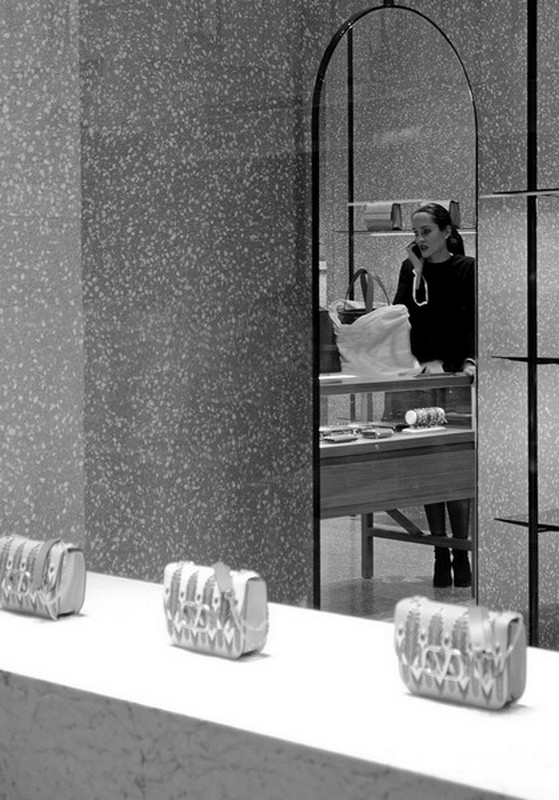
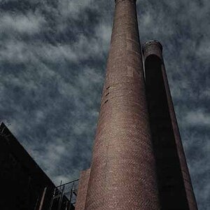
The only thing I don't like about this is the massive watermark across the middle. It totally distracts me from what is otherwise an interesting and innovative image. I spent the first 2 minutes trying to figure out if it was the name of the shop or a watermark, various pointers led me to conclude it was the latter.
Agree with Grandad. I was going to suggest cropping out the handbags at the bottom.for a nice composition. I thought the script in the middle was on a window or something. If it's really a watermark the poster has to be an idiot!
While it's possible to remove the lettering on the window, I wouldn't, I like it. I viewed it as a part of the composition, as if I was standing outside, looking "Beyond this world" into another.