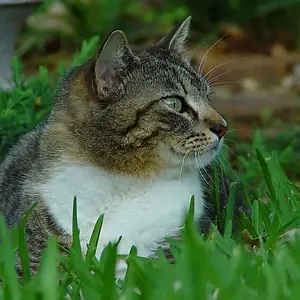
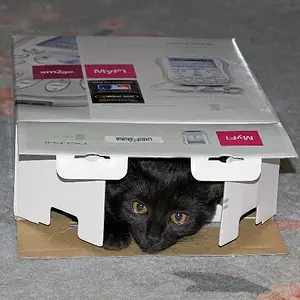
wow the sephia version has a lot of meaning to it. The white in the bottom photo is a little too distracting and takes a lot of attention away from the kittys eyes. Im trying to think of how to improve the photo, i guess you could try using photoshop and add more black to the top of the photo so that the eyes are not centered. you mind if i try?
I like the first one best, but the eyes look most expressive in the last. I'd prefer the pictures a tad smaller, though. This size gives me the impression that I have to take a step away from the monitor to see them better.
Now this is a much better size, I think. And the colour seems more naturally, too. Well done, Shawn.
Regarding the border: I imagine the picture would look quite nice with a border, but that may be just be me preferring pictures that look framed. Give it a try, I'd say.



 green and yellow kittens just don't suit my overall logics

 Give it a try, I'd say.


 Pixmedic's Photo Contest! ($100 prize)