What's new

.

  • Thread Starter 🔹
  • Banned
  • #2
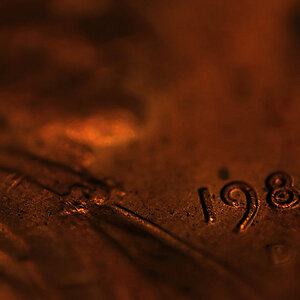
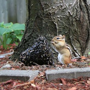
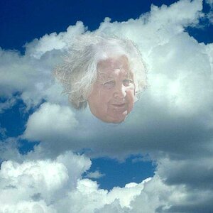
hope no one minded. I know the last one has a little color in it, but I really just didn't want to have to come up with another . title for that one photo.
 
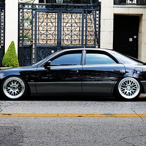
that first shot is actually quite nice, but the processing is a little heavy. Thread title is beyond contrived and annoying.
 
  • Thread Starter 🔹
  • Banned
  • #6
about what I prolly expected.
im using bw and sepia too much now as well.
cant help it I like it.
But I really should be concentrating on color more.
I just like bw better.
But in fifty years someone will be looking at my photos wondering why I put so much stuff in bw
and it throws off the dates they were taken.
Especially since I photo a lot of buildings, I could see how this could become a problem making things look backdated and bw doesn't give a appropriate record.
But I like bw. I cant help it.
I missed out on a recent building, they knocked it down. I probably should have taken photos of it before it was demolished. what was I thinking...
And If I had I probably would have done it in bw messing it up anyway just from doing that..
 
nothing wrong with going B&W, just the blacks on that first shot are clipping pretty severely.
 
  • Thread Starter 🔹
  • Banned
  • #8
nothing wrong with going B&W, just the blacks on that first shot are clipping pretty severely.
tired of looking at grey I suppose.....

I have some old photos of the local area, purchased old maps from before the towns were established. I kind of wonder from that aspect how true to real I should be making these sometimes depending on where the photos might end up down the road. Historical society ways...
Mostly on the buildings, maybe dams and bridges. some obviously don't matter..
 
nothing wrong with going B&W, just the blacks on that first shot are clipping pretty severely.
tired of looking at grey I suppose.....

I have some old photos of the local area, purchased old maps from before the towns were established. I kind of wonder from that aspect how true to real I should be making these sometimes depending on where the photos might end up down the road. Historical society ways...
Mostly on the buildings, maybe dams and bridges. some obviously don't matter..

Your response to this is pointless.
 
I like the composition of the first one, it has nice contrast of light and dark which is what I often look for if I'm thinking of doing B&W (or deciding whether or not to put B&W film in a camera). But I agree something looks off, it seems choppy visually.

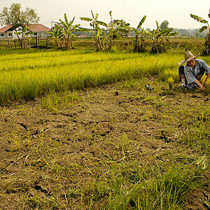
I like the idea of the second one too, it might be too much grass and not enough horse and wagon lol - actually I think less foreground might be better, and more of the trees showing - those light tree trunks would make for a nice background against the rest of the foliage but they're kind of cut off abruptly across the top.

You can create a vintage look but that may or may not convince anyone it's actually an old photo. The second one seems to be a good subject for sepia, but on here at least it borders on being a little too intense? or too coppery maybe. You could look up historic photos on sites like maybe the Eastman House collection to see tintypes, ambrotypes, daguerrotypes etc.

And if you type a word it'd be easier to click on than a dot. Keeping it simple would do - 'scenery' or any one word would probably be adequate.

 
I like the composition of the first one, it has nice contrast of light and dark which is what I often look for if I'm thinking of doing B&W (or deciding whether or not to put B&W film in a camera). But I agree something looks off, it seems choppy visually.

I like the idea of the second one too, it might be too much grass and not enough horse and wagon lol - actually I think less foreground might be better, and more of the trees showing - those light tree trunks would make for a nice background against the rest of the foliage but they're kind of cut off abruptly across the top.

You can create a vintage look but that may or may not convince anyone it's actually an old photo. The second one seems to be a good subject for sepia, but on here at least it borders on being a little too intense? or too coppery maybe. You could look up historic photos on sites like maybe the Eastman House collection to see tintypes, ambrotypes, daguerrotypes etc.

And if you type a word it'd be easier to click on than a dot. Keeping it simple would do - 'scenery' or any one word would probably be adequate.
View attachment 72051

View attachment 72052
 

Create an account or login to comment

You must be a member in order to leave a comment

Create account

Create an account on our community. It's easy!

Log in

Already have an account? Log in here.

New Topics

Back
Top Bottom