I like the colors and all the shots are interesting. But i would have cropped most of it differently. Just to give you some idea. Contrary to other opinions, No 1 and 4 are the least interesting to me.
#1.. horizon is tilted...
#2.. too much background.. not enough subject (even for a minimalist type shot). Read up on composition.
#3.. underexposed.. and crop out the door and hinges....
#4.. see #2 C&C
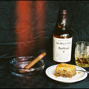
#5.. too busy... what is the subject? Too many competing items... Read up on composition.
I'm having a hard time understanding this book. Where there are pictures I find it to clarify to concept. But where i just see text i have to read the page multiple times. :meh:


")
![[No title]](/data/xfmg/thumbnail/40/40287-4f839095000f74d779b90ed75df9dc62.jpg?1619739408)
![[No title]](/data/xfmg/thumbnail/32/32630-d78de94d84be2acf57d5e0923482b4da.jpg?1619735552)
![[No title]](/data/xfmg/thumbnail/38/38263-ad5e4c9e677626ddb5b1e7cdf9ebe40e.jpg?1619738548)
![[No title]](/data/xfmg/thumbnail/39/39645-11fae384f9fd2ec2813acc42adec0206.jpg?1619739148)
![[No title]](/data/xfmg/thumbnail/32/32632-476f3d925401f13cffe1cc2b41945614.jpg?1619735553)
![[No title]](/data/xfmg/thumbnail/34/34698-b2d730db25fc800b9d7d5baf3d251239.jpg?1619736607)
![[No title]](/data/xfmg/thumbnail/39/39509-3c2c5856429b4b8ff3cf44cd3b2afa8c.jpg?1619739064)

![[No title]](/data/xfmg/thumbnail/32/32163-b5a5e5cde131a9d14df7f164ab9cb8ab.jpg?1619735234)