Just my opinions:
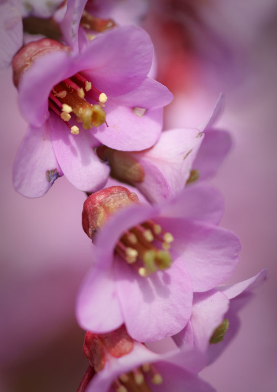
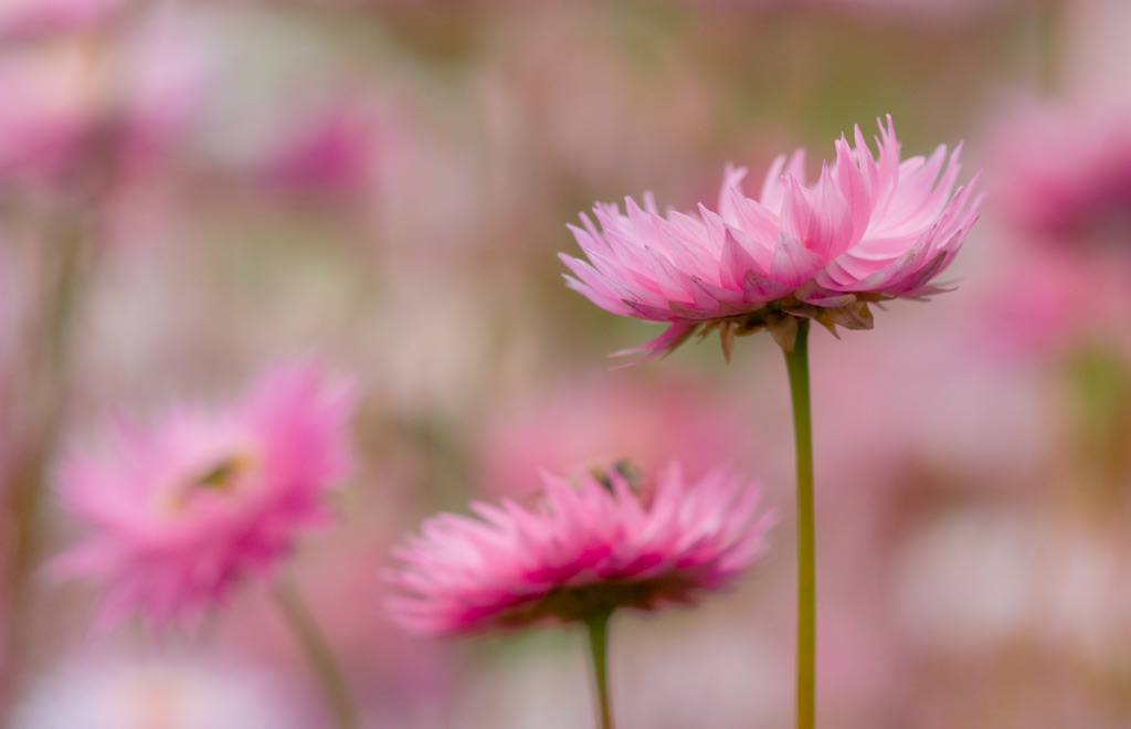
#1 Problems with subject separation. Upper left, in-focus, flower is ok, but the next one down is in focus enough to be distracting. Either the middle and bottom flowers should be in focus (i.e. all three are) or one should be separated - you have something in-between. Try a horz crop that will separate just the top flower. Subject flower has ugly blights and its main stem end is out of focus. Like the background and color scheme.
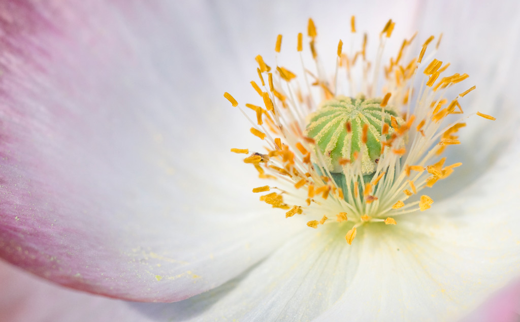
#2 Great perspective on this one. Love the royal crown center (only green). Anthers provide good color scheme. For this one I would try to drop the bottom end of the gamma curve (expodential shape) - you have lots of room down there. [Just downloaded the image and tried it - works well with the crown and anther being brought out and the texture of the pedals improved].
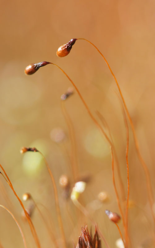
#3 You need to have something in focus [I think the lower left anther is in-focus but can't be sure]. Background is blowing away the subject as well.
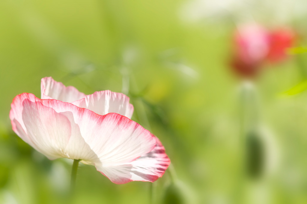
#4 Like this one. Good background, good subject isolation, interesting subject. Good color tone, good lighting... good pix!
#5 Good perspective and presentation. Terrific subject isolation good background. Good color contrasts. Overall image might be a bit on the bright side. Red blob at upper right begins to distract but does balance the flower at lower left.
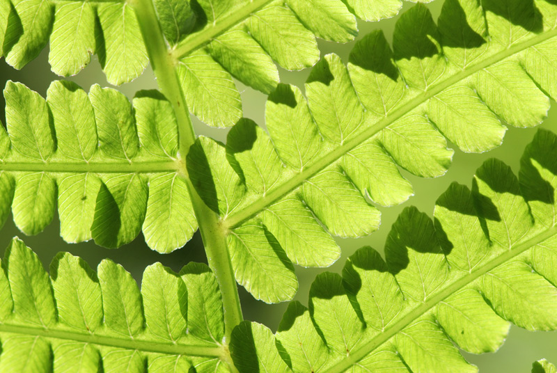
#6 Lighting wrecked this one. Composition is fair with fractal qualities. [Ok, I downloaded and found it can be corrected to a large degree - need a very strong expodential gamma curve and need to drop the red channel down quite a bit, plus boost the sharpness to bring out the patterns on the leaves - result is pretty dramatic].
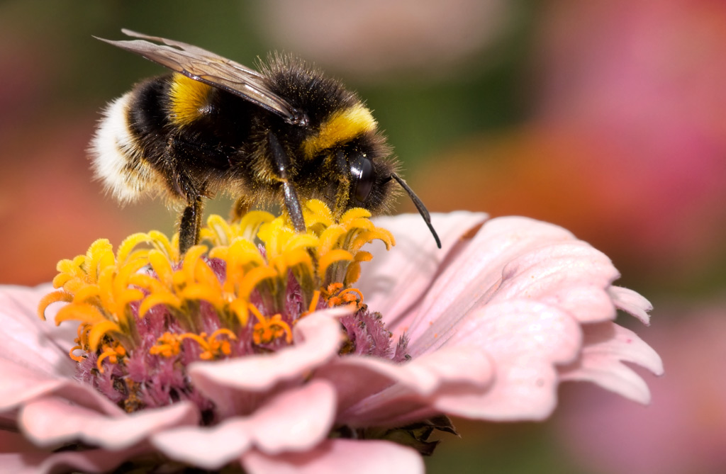
#7 Good shot. Good background providing separation of subject. Flower pedals and back white of bee are blownout a bit, but you don't have any dynamic range left over to work with.
#8 I like this one. Soft image with fair subject isolation. This DOF is what #1 needs.
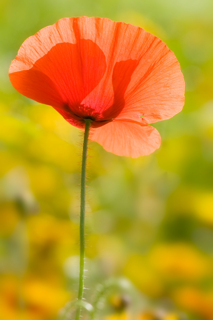
#9 Good background though a bit bright for the flower. Image seems top-heavy, would like the flower a bit down. Like the backlighting of the flower. Good focus and DOF. Good shot.




 .
. :
:



![[No title]](/data/xfmg/thumbnail/41/41922-e7a483d91c9d307d9bb8d6143d03889b.jpg?1734176283)
![[No title]](/data/xfmg/thumbnail/1/1592-cfae4a7ea791f96c6e2d03484be2e454.jpg?1734142210)
![[No title]](/data/xfmg/thumbnail/41/41923-ddfdc5596c5073ae69761e32124481cf.jpg?1734176284)