A cold grave - Color or B&W? C&C

anm90

TPF Noob!
Joined
Dec 21, 2009
Messages
148
Reaction score
0
Location
San Luis Obispo, CA
Can others edit my Photos
Photos OK to edit
Passed by this picture on my first round of sorting without thinking much of it and then saw a nicer crop so I worked on it a little and now I can't decide if I like the color or B&W version better. What do you think? Other C&C is welcome.

1. Color. I wasn't really able to make the color of the leaf pop any more than this... it was a pretty drab and dead looking leaf to begin with though.
LeafatMikes-1.jpg


2. B&W
LeafatMikes-2.jpg


Thanks.
 
Hope you dont mind, (since it says your photos are ok to edit;)), i tried to make it pop a little more...I may have over done it a bit though...
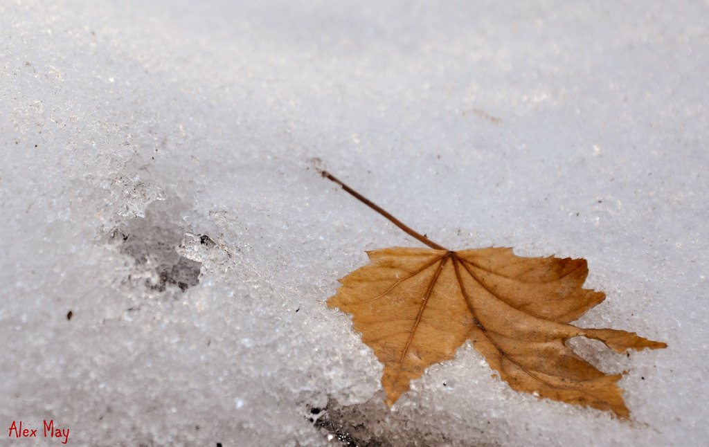
4367433314_e2dc94c521_o.jpg
 
Opened it in my editing program (i use paint shop pro 7) Grabbed my selection tool, set the tolerance up enough so that when i clicked the ice, it only selected the ice and outlined the leaf, then inverted selection so that the selction was on the leaf only instead of the ice, and upped the contrast.
If you have a different program that has different tools, you would have to just figure out which ones to use cause i have no idea what they are called in other programs lol.
 
I hadn't really thought of going into photoshop to do it that way... here's my version with more pop. Probably way over done?

LeafatMikes-1colorpop.jpg


Went into photoshop and did select color range on the leaf and bumped up vibrance and saturation a little each.
 
Nice shot, I like the composition, and the whole idea of it, you have a good eye.

I thought the same thing as Natural Disaster when I saw the first one "could use a bit of pop"

I gave it a go a couple ways. Similar changes might do something for the BW, but I think I would still prefer the color.

The first one was in ACDSee where I increased the Vibrance slide, then in the Advanced Color EQ I hovered over the leaf with my mouse and increased the saturation of the leaf color. Might be overdone for some, but I think the powerful compostition allows for it (just my opinion of course).

p14438944-4.jpg


This next one was with a free PS/Elements (it's for both) plugin called "bold pop" from CoffeeShop (a class act blog) CoffeeShop Free PS/PSE Actions!: CoffeeShop Actions and Presets!

p126430560-4.jpg


Last, Bold Pop, then similar steps in ACDSee

p229702506-4.jpg
 
since no one wanted to have a go at the BnW one, I did. I adjusted the levels and added some sharpening, then I cropped it a little more. Hope you like.

Untitled-2.jpg
 
Thanks! I find that black and white photos look best where there is black and white in them, rather than just lots of gray.
 
I like it as well! Thanks for that. I had completely forgotten some of the rules about black and white since my photo class last year... it seems obvious but I overlooked it!
 

Most reactions

New Topics

Back
Top