What's new

A few B&W photos that i have done

fatmikey916

TPF Noob!
Joined
Sep 12, 2011
Messages
60
Reaction score
3
Location
Orangevale, California
Can others edit my Photos
Photos OK to edit
1.
CSC_0227wm.jpg


2.
CSC_0447wm.jpg


3.
DSC_0706BWwm.jpg


4.
DSC_00282bwwm.jpg


5.
DSC_00332bwwm.jpg


6.
DSC_00452bwwm.jpg


7.
DSC_06882wm.jpg
 
Last edited:
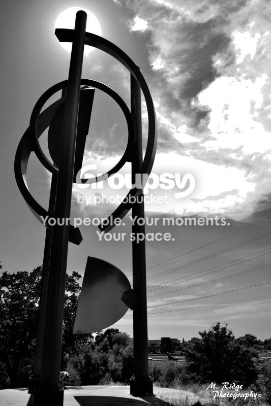
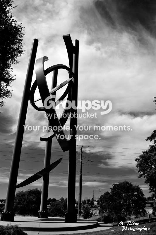
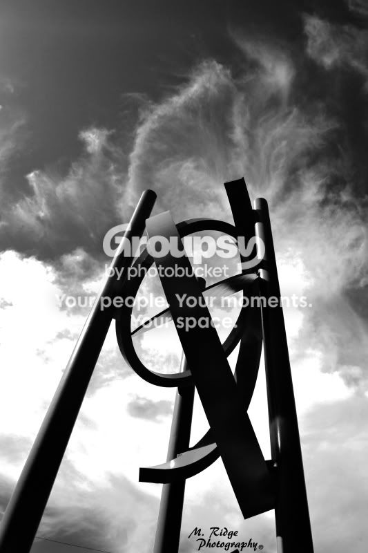
I like the second-to-last shot, number 6 I think? The angle you shot it at makes for an interesting connection between the clouds and the statue.

You didn't say if you want any C&C on these or not (so do feel free to ignore the rest of my post if you were not looking for C&C :) ), but alot of the whites in your sky-related shots look blown out, either from the original exposure or from the B&W conversion....
 
Oh, im ALWAYS open to constructive criticism and helpful tips as i am fairly new to all of this and am always looking for tip to get better. Thanks for your input. Also, im not totally sure what you mean about the sky looking blown out. Please elaborate if possible. Thank you
 
Oh, im ALWAYS open to constructive criticism and helpful tips as i am fairly new to all of this and am always looking for tip to get better. Thanks for your input. Also, im not totally sure what you mean about the sky looking blown out. Please elaborate if possible. Thank you

It means too bright - in some areas the clouds are so white that there's no detail left. Take your photo #6, for example - if you look at the clouds on the left side, they look blank white. But the clouds on the right side look better - they are white, but still have some detail.
 
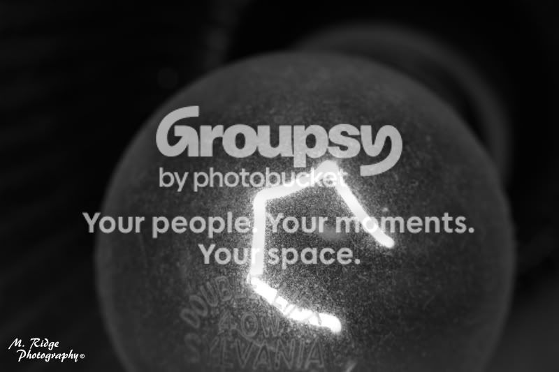
To me the white line (what is it?!?) on number 2, looks like you messed up in photoshop and accidentally erased part of your photo. Seriously.
 
To me the white line (what is it?!?) on number 2, looks like you messed up in photoshop and accidentally erased part of your photo. Seriously.

It's a light bulb. The white line is the glowing filament. You could have read where it says 40w and that would've told you!

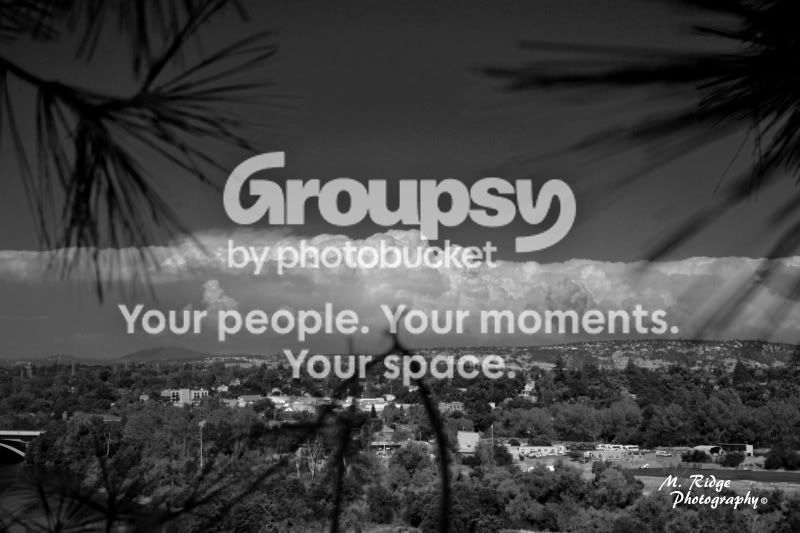
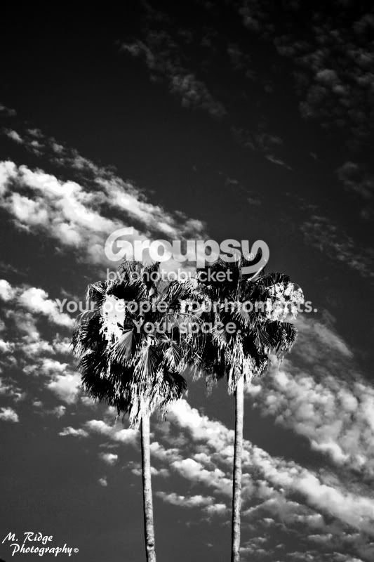
I like the style you are going for in the set, I like the very dark tones. Quite often black and whites look quite washed out, these ones have plenty of depth and character. Out of the set I would say the trees are my favourite, a simple but effective photo.
 
To me the white line (what is it?!?) on number 2, looks like you messed up in photoshop and accidentally erased part of your photo. Seriously.

It's a light bulb. The white line is the glowing filament. You could have read where it says 40w and that would've told you!

I like the style you are going for in the set, I like the very dark tones. Quite often black and whites look quite washed out, these ones have plenty of depth and character. Out of the set I would say the trees are my favourite, a simple but effective photo.

Still not a fan of it. But I can tell what it is now that Im looking at it on my 23" monitor, and not my iphone. haha
 
haha sorry. total noob mistake.

No worries! It just makes it easier for people, since often times they are too lazy to count. Much like myself ^^

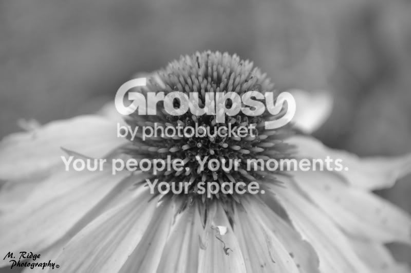
#1 like this one a lot, clone out some of the imperfections on the flower
#2 probably my favorite. that is COOL
#3 the horizontal isnt level - rotate it CW so it is level, and that thing in the center of the picture bothers me. its distracting.
#4 sun pulls my eye away from the subject, distracting
#5 MAYBE a bit too much contrast, but I like it
#6 i would crop out some of the right side so the subject is more in the center
#7 too contrast-y
 

Create an account or login to comment

You must be a member in order to leave a comment

Create account

Create an account on our community. It's easy!

Log in

Already have an account? Log in here.

New Topics

Back
Top Bottom