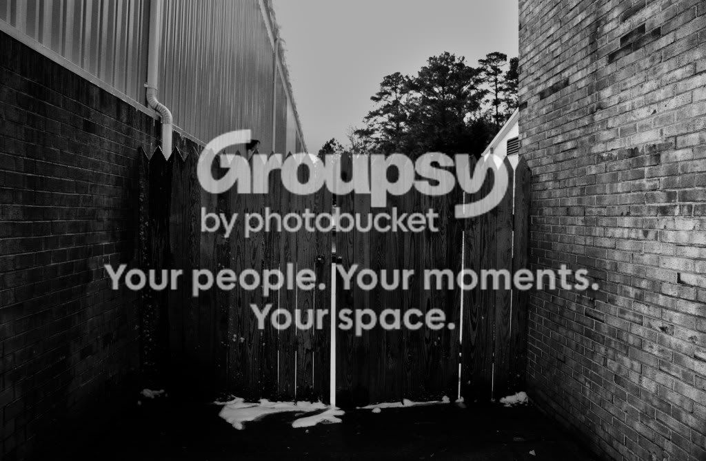
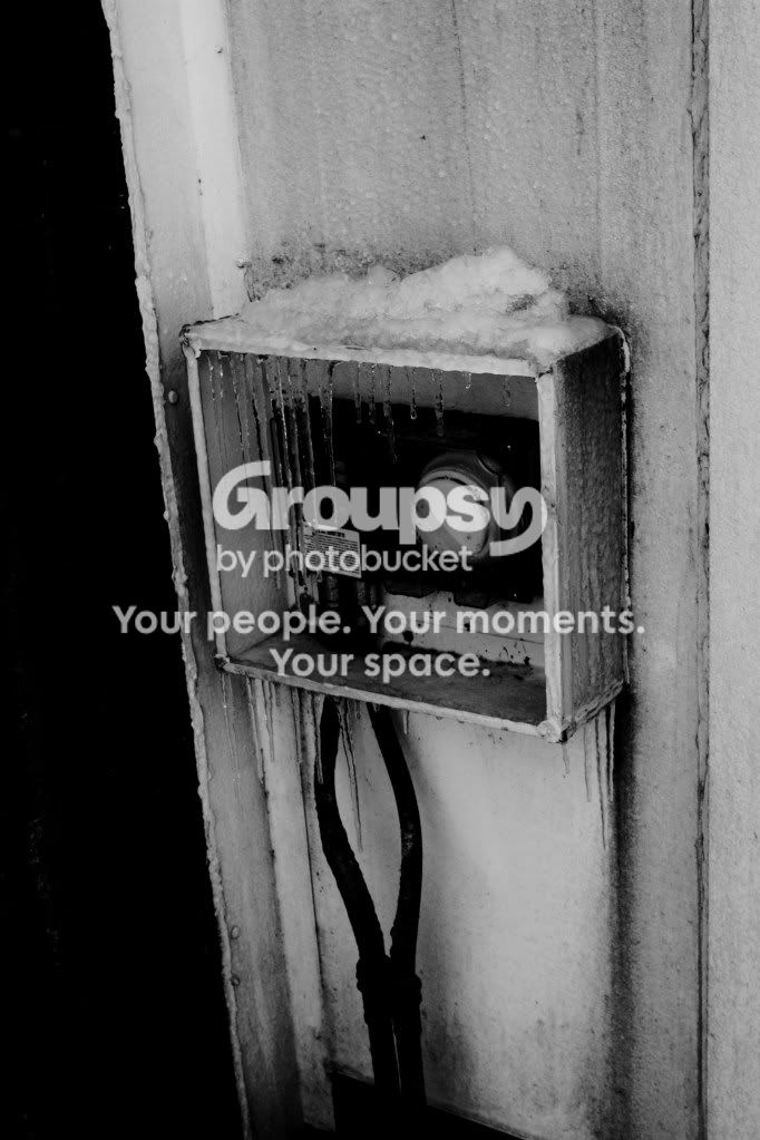
#2 and #8 for me, show signs of improvement and consideration of composition, they look good. #3 is just bad, as you seem to already know. I'm also quite a fan of #7.
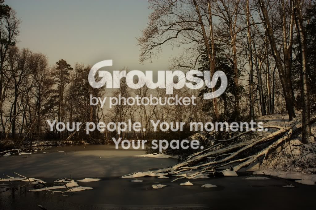
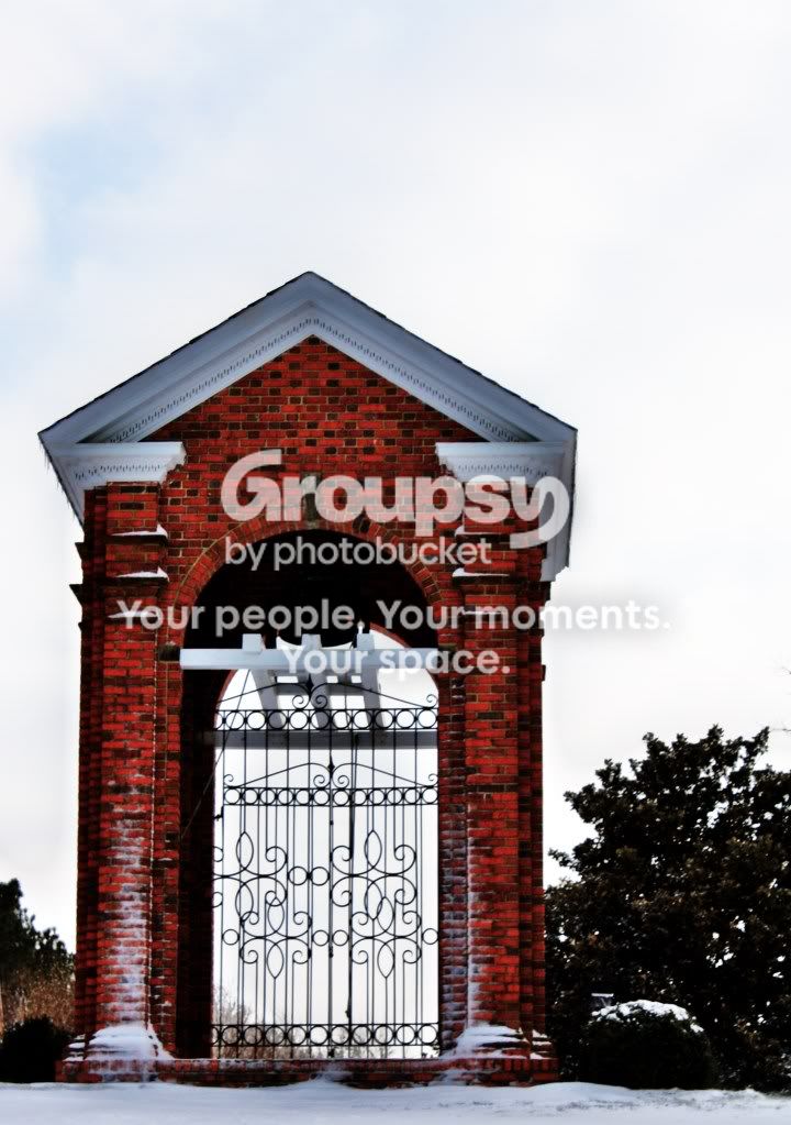
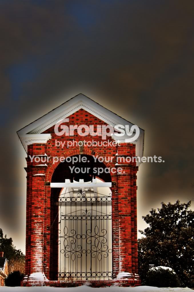
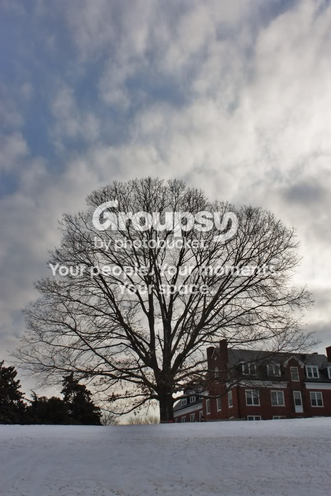
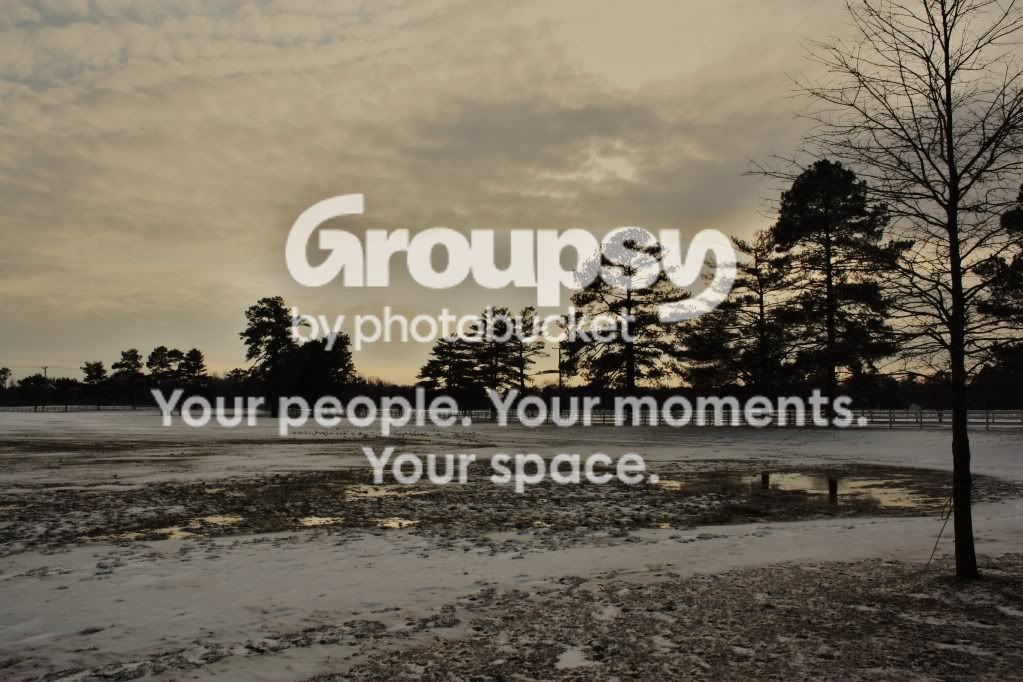
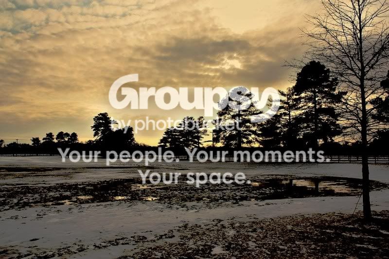
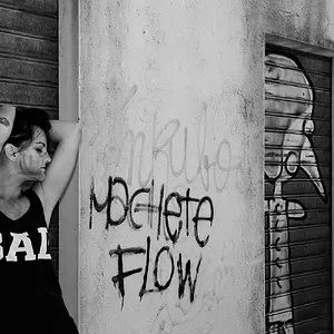
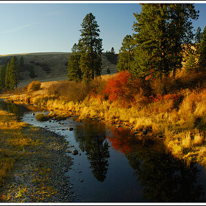
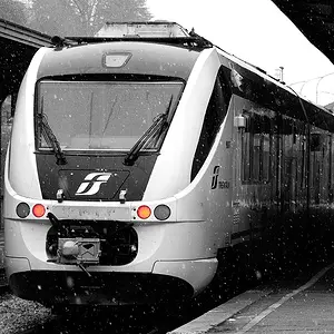
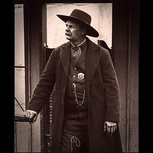
I like the first shot however I would crop the top part out, about 1/3 off the top...I find my eyes are drawn to the empty sky. 2 and 3 I find oversaturated and too much sky for no reason. Last one I also like but again I would crop about 1/3 off the top...You have some nice shots, I would suggest to shoot down(from higher vantage point) as opposed to up, to try and get rid of the empty sky.
Just my 2 cents...
Take care
Syl
Getting better man.
I like the last one, I am not wild that the trees will not lighten up, is that the original you posted? I am in a editing mode tonight so I messed with it some.