Cactiflower
TPF Noob!
- Joined
- Oct 30, 2010
- Messages
- 123
- Reaction score
- 2
- Location
- Mckinleyville, Ca
- Can others edit my Photos
- Photos NOT OK to edit
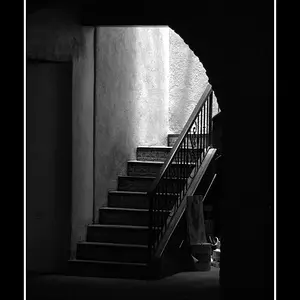
1. 
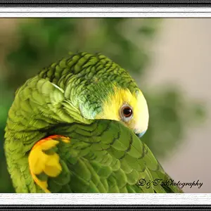
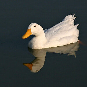
_DSC0496 by Lucky 7 Photography, on Flickr
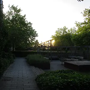
2.
_DSC0163 by Lucky 7 Photography, on Flickr
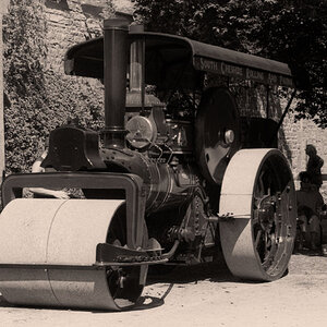
3.
_DSC0101 by Lucky 7 Photography, on Flickr
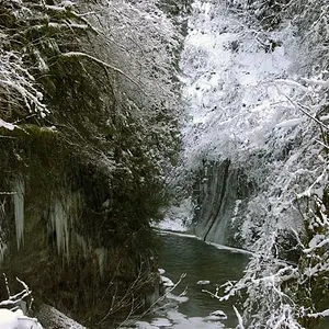
4.
_DSC0241 by Lucky 7 Photography, on Flickr
All feedback and C&C is welcomed!! Thanks for looking!
_DSC0496 by Lucky 7 Photography, on Flickr
2.
_DSC0163 by Lucky 7 Photography, on Flickr
3.
_DSC0101 by Lucky 7 Photography, on Flickr
4.
_DSC0241 by Lucky 7 Photography, on Flickr
All feedback and C&C is welcomed!! Thanks for looking!