
mJs
TPF Noob!
- Joined
- Aug 3, 2009
- Messages
- 154
- Reaction score
- 0
- Location
- Vancouver Island
- Can others edit my Photos
- Photos OK to edit
I like the black and white best... the color is just a bit too much... or how about not quite fully black and white? like this:


 . I must inform my wife that we need to spice things up. As you detected, my reference is to your expression that the red rose on the B/W piano is cliche. Just because we see it a lot doesn't mean we shouldn't like it or repeat the process. New and creative photography is great and I appreciate those that are always pushing the edge to find new ways of expressing themselves, but I hate to banish something appealing because it has been done before.
![[No title]](/data/xfmg/thumbnail/32/32707-3c49d54a87afb53e65c60391858400be.jpg?1619735611)
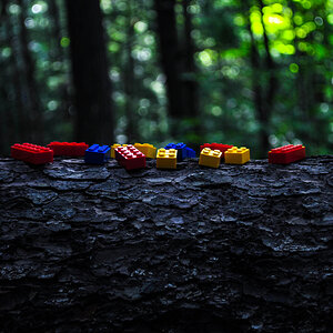
![[No title]](/data/xfmg/thumbnail/37/37108-62307f01c11ef92f5655ed4501d565ce.jpg?1619737882)
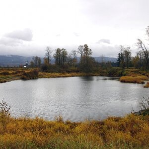
![[No title]](/data/xfmg/thumbnail/34/34040-14af4007923299ad46d35fc110d0faad.jpg?1619736250)
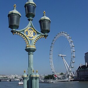
![[No title]](/data/xfmg/thumbnail/37/37110-1d5d98524f9f6a8623703161610ef439.jpg?1619737882)
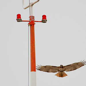
![[No title]](/data/xfmg/thumbnail/31/31751-fb2f68cca32f9eec468dbde7d649840f.jpg?1619734990)

![[No title]](/data/xfmg/thumbnail/32/32706-50b778fbc110c8ea4472547d54c6a923.jpg?1619735610)