Navigation
Install the app
How to install the app on iOS
Follow along with the video below to see how to install our site as a web app on your home screen.
Note: This feature may not be available in some browsers.
More options
You are using an out of date browser. It may not display this or other websites correctly.
You should upgrade or use an alternative browser.
You should upgrade or use an alternative browser.
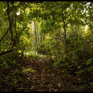
A Quiet Morning
- Thread starter rhammitt
- Start date
lostprophet
No longer a newbie, moving up!
- Joined
- Feb 10, 2006
- Messages
- 11,792
- Reaction score
- 181
- Can others edit my Photos
- Photos NOT OK to edit
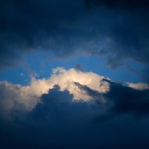
thats so good its getting a nomination in Photo Of The Month :hail:
The Phototron
TPF Noob!
- Joined
- Jun 26, 2007
- Messages
- 948
- Reaction score
- 0
- Can others edit my Photos
- Photos OK to edit
No kidding! And screw contrast, it's MISTY.
Alpha
Troll Extraordinaire
- Joined
- Mar 15, 2005
- Messages
- 5,451
- Reaction score
- 41
- Location
- San Francisco
- Can others edit my Photos
- Photos NOT OK to edit
Nice shot.
It doesn't need more contrast, but the shadows are almost entirely in zone 3 and 4 and still blocking up a bit. So I'd say it needs a lot more depth there.
It doesn't need more contrast, but the shadows are almost entirely in zone 3 and 4 and still blocking up a bit. So I'd say it needs a lot more depth there.
Most reactions
-
 213
213 -
 191
191 -
 185
185 -
 185
185 -
 175
175 -
 155
155 -
 141
141 -
 126
126 -
 123
123 -
 94
94 -
 78
78 -
 78
78 -
 76
76 -
 74
74 -
I
67

![[No title]](/data/xfmg/thumbnail/34/34082-cb4fe628070c391a1a71b4fdcc58f400.jpg?1619736268)


![[No title]](/data/xfmg/thumbnail/37/37525-e6d8ac7dbf90f97648e351449fc9330f.jpg?1619738130)
