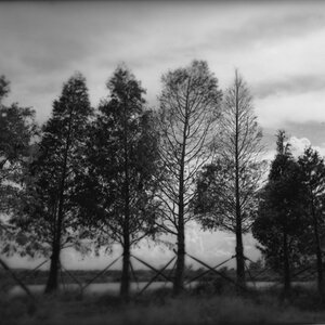
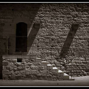
I like #2 & #4
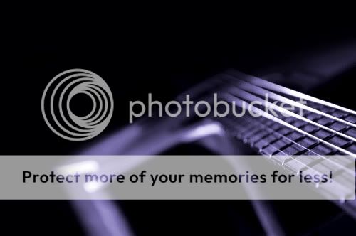
#1. I like the perspective, but it could be better by levelling the image just a tad clockwise... It's ever so slightly off the horizon. Also just a tad more light on the body of the guitar to cue us as to what it is would make it more effective.
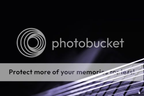
#3. Again, just a kiss more light on the body.
#5. Love the specular highlight, but the darkness on the rest of the chrome suggest to me that the photo is underexposed.
Overall, though, I'm not really digging the purple tint.




![[No title]](/data/xfmg/thumbnail/35/35262-02f8eba4a2a92dbae0b55547bba80b4f.jpg?1734166920)
![[No title]](/data/xfmg/thumbnail/37/37104-99933b18ee16678a8299f12747336d48.jpg?1734169829)