Screw you all. :greenpbl:
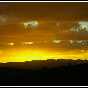
I like it. It has a painterly quality to it. I think you could bring the saturation levels up just a wee bit, being careful not to posterize the purple, in particular.
This is one of those that may benefit from a wee bit of softening as well. There is a fairly defined centerline, and I am torn as to whether I would suggest a crop to get it off center, but I think no, not necessary. I dunno, maybe crop the top down a bit to exclude the "glare" in the top right.
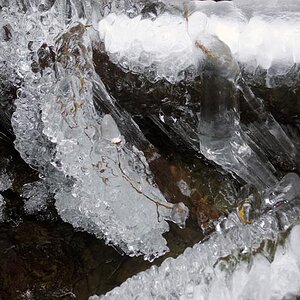
No, this image doesn't have a "wowee" sort of impact. The blues and purples are moody and the image is contemplative.