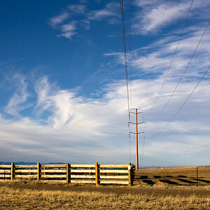
An Interesting Approach: Shoot in Monochrome / Edit in Color

Austin Greene

Been spending a lot of time on here!
Joined
Jan 6, 2012
Messages
1,472
Reaction score
855
Location
Mountain View, California
Website
www.austingreenephotography.com
Can others edit my Photos
Photos NOT OK to edit
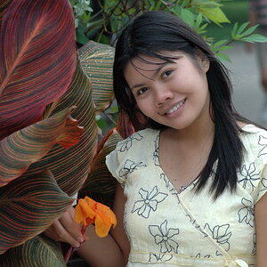
I was speaking with a coworker and pretty solid portrait photographer the other day and he mentioned a technique which I had never really considered. The guy takes great portraits, usually all natural light, and usually at sunset out on the coast, so we're talking some tough lighting situations.

What he does, is always shoot in monochrome (style setting) on his Canon. Since he's shooting in RAW, the color image comes up upon import to Lightroom. 90% of his images are color when published. Yet, he says that by shooting in black & white, it gives him a better sense for contrast and contours on the camera's LCD when he's in the field.

Anyways, I thought that was interesting, and I'm certainly going to give it a go sometime during a portrait session.

What do you think? Outside of people who always shoot in black and white, have any of you tried this technique? Strictly speaking: shooting in monochrome for viewing, then editing in color after the fact?
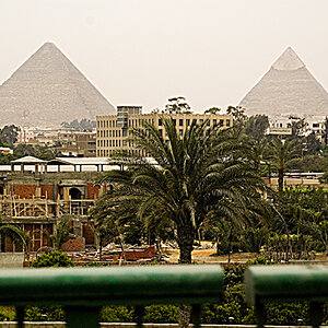
 
If you mean 'shoot in raw, but view the in-camera preview in monochrome', yes. Shooting in raw retains all the color data of the image, so during editing you can edit based on color and not just luminosity alone.
 
I've heard it being suggested before. never tried it, but it has merits to me.
 
I dunno, that seems dubious to me.

B&W and color aren't the same kinds of photos, generally. Maybe it works if you're looking for a B&W aesthetic, with color images.
 
I could see it being very useful on lower quality LCD's but some of the higher end Canon/Nikon bodies have damn good color and contrast quality.
 
If you mean 'shoot in raw, but view the in-camera preview in monochrome', yes. Shooting in raw retains all the color data of the image, so during editing you can edit based on color and not just luminosity alone.
Yep, that's what I detailed in the post. Tried to be pretty specific. Strictly speaking about shooting in RAW, viewing all previews in monochrome by setting to "Monochrome" style (in Canon, not sure what Nikon calls it) and then editing in color.

To boil it down, we're talking about using a black and white preview as a way to better estimate the contours/contrast of a RAW image which will later be published as color.
 
I don't preview in monochrome unless I'm intending the image to be edited to shades of gray. If my intentions are color in the final image, then I preview in color.

I can see the merit of using monochrome preview, however, since shooting in raw allows all colors to be dealt with in post with ease.
 
Had to experiment since had never used this technique before. In Nikon it's a "Picture Control" and works in raw. With the shot displayed in the Live View screen it works well. You can see the gradients and get a pretty good idea of the lighting. Once you go to the pc it's in color, of course, and in ACR (I use Photoshop) you can click the Monochrome box and work the individual colors.
Can see the value in certain situations.
 
I did this a lot with my Canon 20D back in the mid-2000's, shooting in Monochrome mode, using the Sepia Tone color tone option, and the Yellow Filter Effect setting, in RAW + JPEG, medium size JPEG mode, Fine compression. I still advocate actually shooting in RAW + JPEG B&W mode is the end result is eventually to go to B&W images.

A couple weeks ago I gave a photo lesson, and shot Canon 20D as set up above, and after the shooting part of the lesson, we went through my student's photos and mine in Lightroom and reviewed key frames and talked about what elements and principles of design were at work in the pictures. Being able to examine the elements and principles of composition and design was the key to the lesson, and having my example shots in B&W was a key part of that. At times, color is just a distraction when the emphasis is on identifying and working with what elements are being used, such as lines, or shapes, textures, and so on, and what principles of design are in action, such as repetition, harmony, variety, or dissonance.

Black and White removes color relationships, and shifts the relationships to tonal relationships. Black and White is a helpful way to abstract the subject a little bit, and it forces the viewer to focus more on lines, shapes, masses, and things that might be considered "the skeletal structure of the body", rather than the pretty and colorful cloak of fashionable clothing worn on the outside, to use an analogy.
 
_MG_3858_2005_18thSept.jpg

On this computer, I only have this one image that was shot this way with the Canon 20D. Shot 18th September, 2005, with the 100mm EF Macro lens, in RAW+ JPEG mode, this is a down-sampled image made off of the SOOC JPEG file. At the time I was shooting this, I was struck by the beauty of the window light hitting my son's face. He was so,so little back then! I never did convert this image to color...it has always lived in sepia tone.
 
A wonderful image Derrel, and your post spurs an interesting question for me:

Could one say that shooting in this way might build better compositional or exposure technique? That is to say, if you have a solid image without the influence of color, and then you convert it to color only to find they work wonderfully, isn't that a plus? Just thinking out loud, but I'm not convinced it really would make any difference in the long run, I don't think it's a technique to apply to all environments.
 
Derrel and I had this conversation probably 8 months ago about shooting street photos. I tried it some but it's not something that I have done much of. I like the idea of shooting in raw + jpeg. Looking at the jpeg will give you an idea of whether the image would be better in color or b&w.
 
Austin Greene said:
A wonderful image Derrel, and your post spurs an interesting question for me:

Could one say that shooting in this way might build better compositional or exposure technique? That is to say, if you have a solid image without the influence of color, and then you convert it to color only to find they work wonderfully, isn't that a plus? Just thinking out loud, but I'm not convinced it really would make any difference in the long run, I don't think it's a technique to apply to all environments.

Well, this subject has come up at least a half dozen times since I've been here at TPF, and I've always advocated that people at least TRY this method for a bit, to see for themselves what it does. One of the things digital shooting gives is instant, on-screen feedback of the image captured. The in-camera histogram and or blinkies reference the in-camera JPEG. A careful worker is going to set the camera up the best way regarding tone curve and in-camera sharpening (or none) for the SOOC JPEGS that will be created. Canon has a very easy to use way to adjust capture parameters, with a really great on-screen control panel. By shooting with lighting that's best for B&W, and reviewing in B&W, at the time of the shooting, it's easy to literally SEE how the lighting works in B&W. I'll be brief: look at a 1950's film noir detective movie and you will see very high-ratio lighting, which B&W film stock could handle pretty well. Then, look at a color film shot a couple years later--very flat, traditional color lighting ratios of like 3:1, 3.5:1, 4:1 maybe for drama. Color and B&W often benefit from very different lighting patterns and ratios and modifiers.

And HERE'S WHERE this is very valuable: shooting in B&W mode if you want B&W for portraiture will SHOW you something that's not so apparent in color review: the diffuse highlights on the person's face. B&W portraiture benefits from a lot more crispness to the diffuse highlights on the face...the optimum degree of highlighting on the skin planes (forehead,nose,cheekbones,chin) that looks best in B&W will often look not-so-good in color. I learned this from a master celebrity photographer, Gary Bernstein', whose books on photographing people were really popular in the 1980's. I learned it sort of indirectly. He said that when you shoot for B&W, he always liked to use SMALLER light sources.

One of the things I've found is that "crisper" umbrellas, ones that give more punch to the diffused highlights on the facial planes, often look too hot in color, but that diffuse highlight crispness looks great in B&W shots! Metallic silver-lined softboxes, metallized silvered umbrellas like the ones made by Speedotron, and so on--those types of light modifiers create rather hot diffused highlights on the skin's contour planes...maybe not good in color, but fine in B&W.

In my example photo, the skin's contour planes are revealed in the highlights. In color, that shot looks like crap. I know you shoot a lot of portraiture, so I think you'll have a lot of opportunities to see how a higher lighting ratio, along with more "crisp" modifiers look very nice in B&W. The modern era, digital shooters rave on about big, big modifiers and 60 inch umbrellas and eight foot octobanks, yadda yadda...but that's not the best way to light for B&W...those huge modifiers are excellent for producing soft,diffused, fairly shadowless lighting, which is often just not the right kind of lighting for showing shape, or texture, or presence, when the image is shown in B&W. Again, my mantra on this subject has been, "If you're going to shoot for B&W, then light for B&W, shoot in B&W, and review the images in the field in B&W."
 
Last edited:

Most reactions

New Topics

Back
Top