@meccalli: I'm sorry, what dark area over the mountain? The whole thing?
@BusRider: Loved your edit! I got something similar while I was playing around with the pic. I was just wondering if it doesn't look too unnatural if the sky turns white on the top? Maybe not! And you're right the portrait crop does seem to suit the pic better. Thanks!!
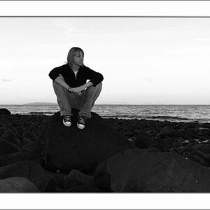
The horizon is a bit tilted. I like the overlapping planes in the hills behind. I do prefer this as a horizontal, but the vertical crop does show how important some type of strong foreground element is in a photo like this; the silhouette of the man standing at the lake's shore area really,really helps with the sense of distance and scale. Cropping out a lot of the scene and making the man's silhouette more of a central part of the composition helps strengthen the photo.
I don't like the look of that sort of unusual, icy-cold blue sky in the vertical crop though...that looks kinda' weird to me, like the photo was shot on really old,bad,expired Ektachrome.
Oh the Sky, I know what you mean. I'm not sure why the image looks so dull. I think I screwed up the WhiteBalance. It says it's "Fine Weather" which is not what I needed to have after sunset! :|
Oh the Sky, I know what you mean. I'm not sure why the image looks so dull. I think I screwed up the WhiteBalance. It says it's "Fine Weather" which is not what I needed to have after sunset! :|
I definantly like this a lot. I think you should stick with the horizontal image though. The vertical one cuts out a lot of the scene, which is beautiful. I would maybe saturate the color some and straighten out the picture so that it doesn't look as tilted. I'd just play around the with a photo editor a bit with it and see where it takes you. You could do a lot with a beautiful photo like this.


")


![[No title]](/data/xfmg/thumbnail/31/31742-596f6bbc60b2ba7fed2cd25f5aacf41c.jpg?1619734985)


![[No title]](/data/xfmg/thumbnail/33/33340-27d18dd642b5257e4b9a04a4c1feffd1.jpg?1619735910)
