NielsGade
TPF Noob!
- Joined
- Jun 20, 2009
- Messages
- 57
- Reaction score
- 0
- Location
- Denmark
- Can others edit my Photos
- Photos OK to edit
My main issue is composition. I'm not sure if I'm a genius or horrible.
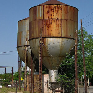
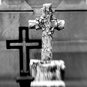
1.

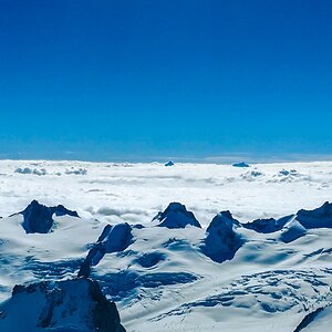
2.

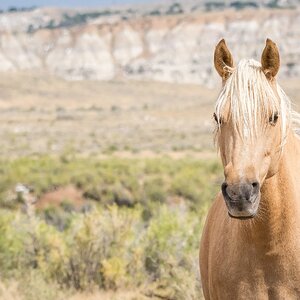
3.

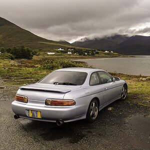
4.

5.

6.Playing with lighting. I had a big light in the front and a little spotlight to light his back. I think the front light should have been higher up.

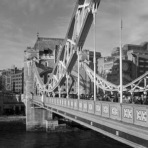
1.
2.
3.
4.
5.
6.Playing with lighting. I had a big light in the front and a little spotlight to light his back. I think the front light should have been higher up.


![[No title]](/data/xfmg/thumbnail/42/42257-4c4b35d60337b1b4ec661332486a33be.jpg?1619740066)