What's new

Ashley - cc welcome.

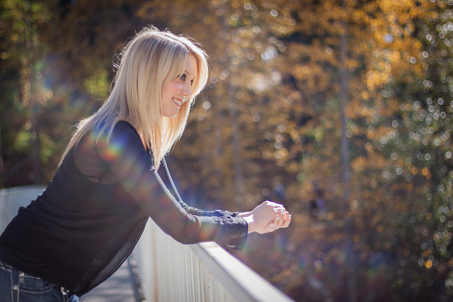
I think they are all great. However my eye is perhaps a little untrained. Only thing I might suggest is a little more light on her face in the first pic.
 
Number 2 is great. With such a pretty subject, you can't shoot anything wrong.
The only thing I see is you need to use a lens hood or bellows. 1 and 3 has lens flare.
 
Bokeh Bokeh and more bokeh. Not to keen on the framing. Num 2 would have to be my fave but again the hands are cropped so it just seems incomplete. I agree with RichardH as it relates to the lens hood because there's a little flare going on. Good bokeh though. Mind me asking what lens?
 
Thanks for the input thus far everyone. Im using a Canon 50mm 1.8.
 
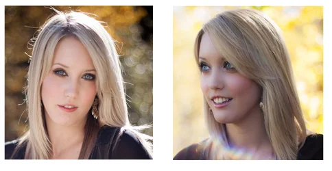
Okay, two things stand out. In one of the photos, Ashley is facing the direction the light is coming from, and the shadowed side is on the right hand side of the frame. Notice how the defined light SHAPES her cheekbones and he face? She has beautiful cheekbones, and a lovely face! The shot with her looking camera left makes excellent use of the lighting that was there! Her face shows dimension, and shape, and lovely form. Now, contrast that with the backlight + fill light photo, where she was faced away from the light at the scene, and fill light was used to brighten up her face. Her face looks narrow, and very long, and "flat"...the difference is startling!!!

I took the liberty of re-sizing the images to get about the same-sized head from forehead to chin. Then I cropped the images to squareish, and made this comparison, brightening up the better-lighted, right hand side "short lighting" image to be more equal to the backlight + fill image on the left. I think I have a strong preference as to which is the better rendering of this lovely young woman's face.

What do you think? Is one lighting pattern preferable for her?
$Lighting Examples-Curves.webp
 
I really like the first one, but it needs a bump in exposure.
The second one is exposed beautifully, but I agree with Derrel on the facial features.
The third is beautiful. That bit of lens flare is a little painful. It's not adding to the image the way that lens flare can. It seems to be more of just a distraction than of value.
They're beautiful shots!
 
Okay, two things stand out. In one of the photos, Ashley is facing the direction the light is coming from, and the shadowed side is on the right hand side of the frame. Notice how the defined light SHAPES her cheekbones and he face? She has beautiful cheekbones, and a lovely face! The shot with her looking camera left makes excellent use of the lighting that was there! Her face shows dimension, and shape, and lovely form. Now, contrast that with the backlight + fill light photo, where she was faced away from the light at the scene, and fill light was used to brighten up her face. Her face looks narrow, and very long, and "flat"...the difference is startling!!!

I took the liberty of re-sizing the images to get about the same-sized head from forehead to chin. Then I cropped the images to squareish, and made this comparison, brightening up the better-lighted, right hand side "short lighting" image to be more equal to the backlight + fill image on the left. I think I have a strong preference as to which is the better rendering of this lovely young woman's face.

What do you think? Is one lighting pattern preferable for her?
View attachment 24474

Professor Derrel, great lesson.
 
The lens flares are very distracting here.
 
Thanks everyone for the input. Special thanks to Derrel for the very detailed feedback, I really appreciate the time you took to teach me what I could do better. I only had a reflector providing the light in both of those images so im guessing that the major difference in detail is because of the direction the reflector was putting light back on her face. My assistant was holding the reflector at about 45 deg waist height in that shot, what technique or tweak could I have used to get the proper light on her face?
 
Number 2 is such a great shot :thumbup:
 

Create an account or login to comment

You must be a member in order to leave a comment

Create account

Create an account on our community. It's easy!

Log in

Already have an account? Log in here.

New Topics

Back
Top Bottom