Oh, more pics of the series. Nice.
Of these I like the first best ... it borders on being a bit dark ... I don't know if you are allowed to PS your frames or if all changes or all sorts of printing have to be done in the darkroom for this? Anyhow, I think I would like to see the whites whiter in 1. But I certainly like that "brick-corner" there!!!
2 is a bit "untidy" ... ok the area IS that untidy, but the composition is a bit cluttered. Maybe you should have gone closer to the wall and leave out that much of the ground in front?





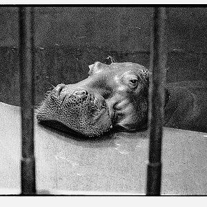
![[No title]](/data/xfmg/thumbnail/37/37633-94737d4436dff45b827dcc332ff7fba9.jpg?1734170757)