What's new

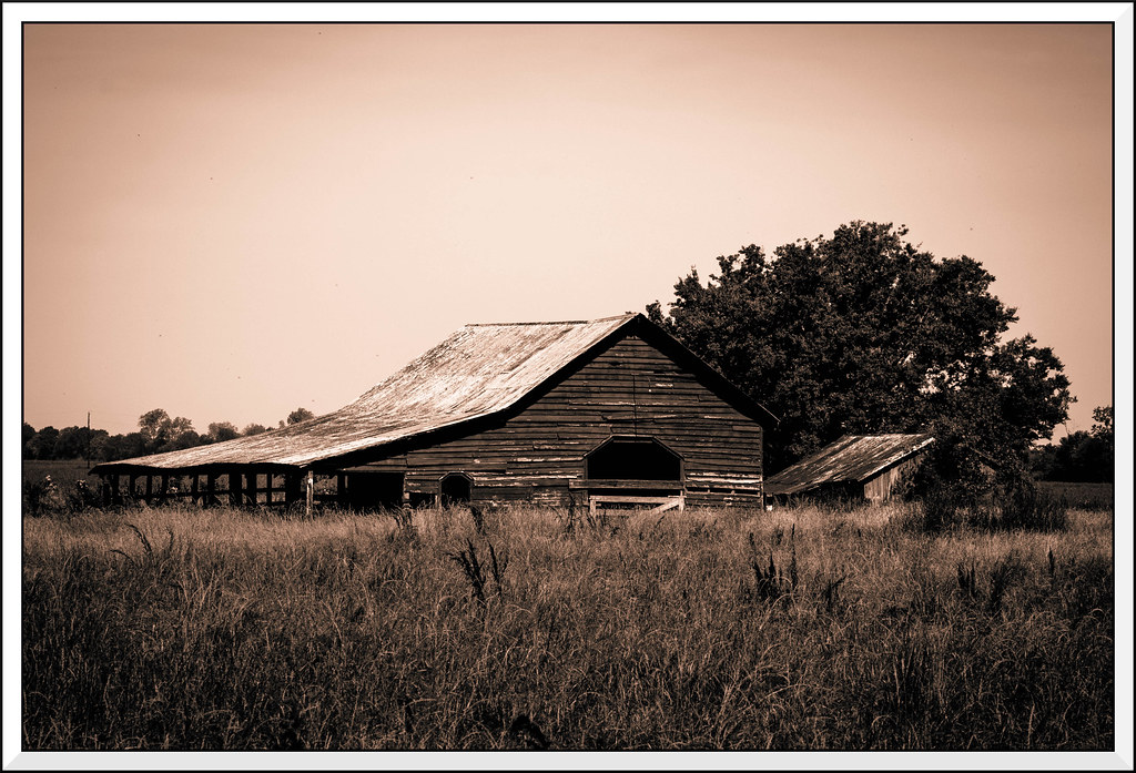
Barn - C&C welcome

I like it, there is some romance in it.
 
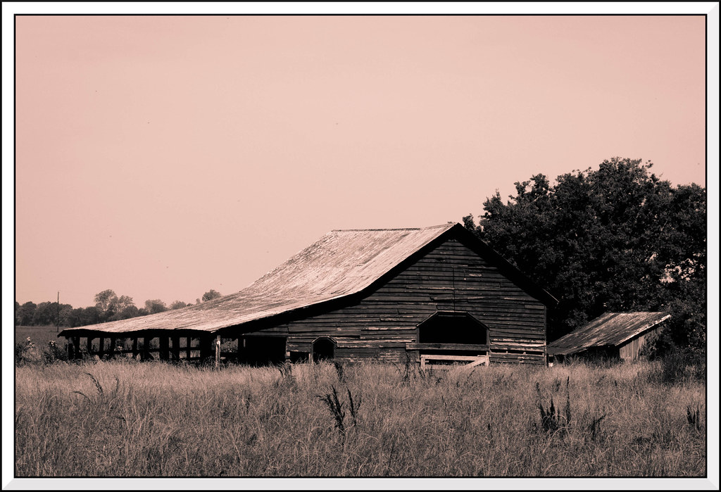
Works pretty well for a long shot - I'd be more interested in a closer look at the barn, but maybe that's just me. In this image I would back off on the vignette and crop some of the foreground and some on the right, well into that tree.
 
I like the sepia tone on this one, the vignetteing not so much.
 
I like the composition as-is. I would cut back on the toning and the vignette, and maybe ease the contrast down a bit as well. It's a bit harsh, and I'm sure the buildings especially are a lovely mass of interesting grays.
 
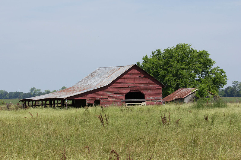
Second image added to original post and the untouched original
 
Second image added to original post and the untouched original
I like only the originally posted. Call me sucker of b&w. The only thing I would do differently is choosing a little more washed out sepia and it would be good for hanging on the wall.
 

Create an account or login to comment

You must be a member in order to leave a comment

Create account

Create an account on our community. It's easy!

Log in

Already have an account? Log in here.

Back
Top Bottom