Beginner, c&c please

ChefStaller

TPF Noob!
Joined
Sep 20, 2010
Messages
34
Reaction score
0
Location
Glass City, Ohio
Can others edit my Photos
Photos OK to edit

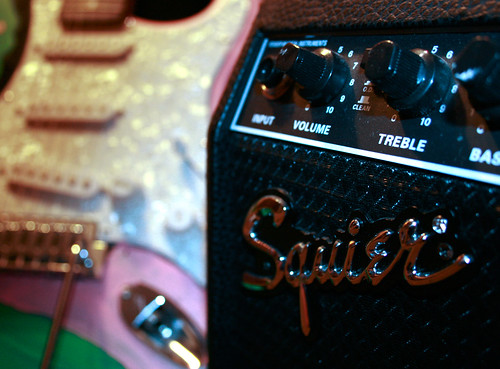
squire (1 of 1) by ChefStaller, on Flickr

Shot with two 60 watt bulbs, my on board flash and with the exposure comp way down.
1/8th sec
iso 800 (i have no tripod yet)
f 4.0
24mm (on my kit lense)
Rebel Xti
Couldnt seem to get the flash and the lightbulbs to balance out. the amp looks rather blue to me. What i would have like to have done diffrent was have a tripod so i didnt have to handhold this shot. I layed down on my stomach and tried to be as steady as possible. Then I could have forgoten the flash all together.
 

squirebw (1 of 1) by ChefStaller, on Flickr

Here is the B&W. What a was going for in this shot was an interesting angle, a balance between darkness and light, strong lines, usage of the rule of thirds, and some repeating patterns(i.e. the knobs)
thanks again for looking
 
Last edited:
the color is an ok shot. i like the pink and green. subject matter is not interesting.

not a good candidate for b&w.
 
the color is an ok shot. i like the pink and green. subject matter is not interesting.

not a good candidate for b&w.

Can you explain to me why it is not a good candidate for a b&w, as i like the b&w better. As far as the subject matter I am focusing more on my skillset of being able to take a nice photograph, althought I do find guitars and amps very interesting.
 
Can you explain to me why it is not a good candidate for a b&w, as i like the b&w better.
because all the wonderful pretty blues and greens and pinks are reduced to a boring, blah gray.

out of curiousity, may i ask what you find so appealing about the b&w version?
 
i really like the strong divide between the guitar and the amp. That line that goesstraight down the center. I liked the color too, i just felt the b&w had more impact and was better as an over all shot
 
well it's not like the line disappears in the color version. that divide only seems strong in b&w because the tones/colors of the guitar get washed to oblivion. also note how the squire logo becomes more difficult to read without the red highlights.

etc, etc.
 

Most reactions

New Topics

Back
Top