my thoughts,
1. Cool but has too much in the picture... I would crop
2. I love it. Perfect.
3. You could've done a lot of cool stuff with that tunnel. The pic is still impressive because it brings the eye down that path.
4. I love the coloring, it's a nice vintage look.
5. I love this. It's awesome. Nice suburb neighborhood pic.
6. Needs something... less distortion.
1. There's nothing my eyes can focus on. Tighter crop would be good.
2. Absolutely stunning shot, love it.
3. It looks slightly out of focus for me and the composition could've been better.
4. I like what you've done to it. And btw you could get rid of that little black spot of something on the left hand side. It's above the rock(?) in the corner.
5. Great shot. The lines lead my eyes into the photo. Brilliant.
6. I like the composition, but the highlights seem to be blown out a little.
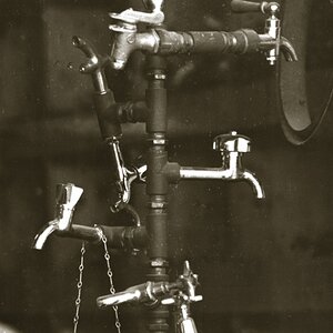
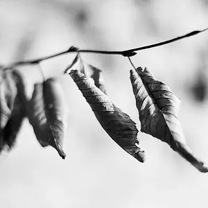
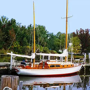
I like the abstract approach to the first 3 images. The 1st could probably do with a bit of a crop (top and RHS) and a bit of a contrast boost. Second and third I rather like as is. Nice use of DOF on all 3 shots (pretty bang-on perfect I'd say!)
Not too much of a fan of selective colouring (but I think it's something we all need to try ). The two tower shots are okay ... nothing to get excited about though (if i'm to be brutally frank).
I think you've got a pretty good eye for a shot. Keep up the good work
on the selective colouring one, your horizon is crooked. for me, that takes away from the whole 'lines leading the eyes down the road' thing and just spoils it.
LOVE 2. it looks brown to me, not black. what is it?



 ). The two tower shots are okay ... nothing to get excited about though (if i'm to be brutally frank).