beginner saying hi, few shots to C&C

Plastic

TPF Noob!
Joined
Nov 3, 2008
Messages
15
Reaction score
0
Location
paradise
Can others edit my Photos
Photos OK to edit
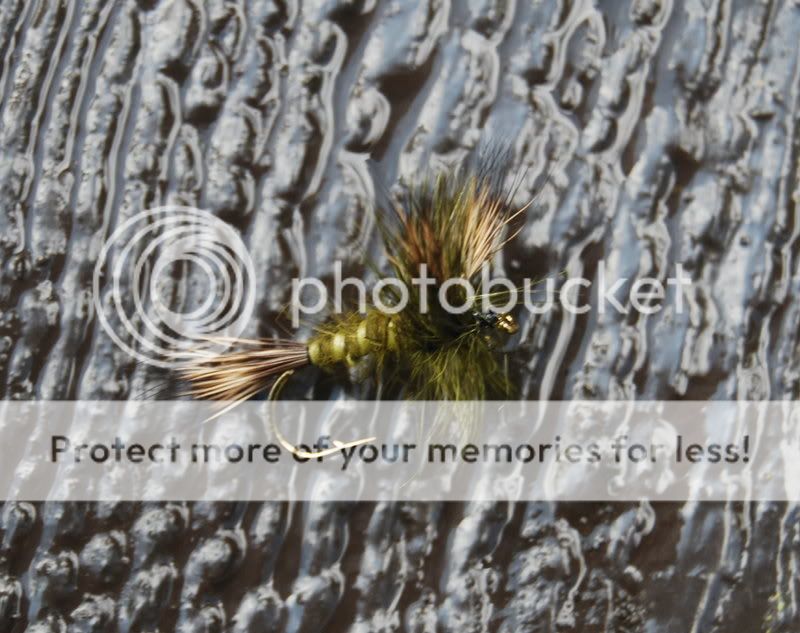
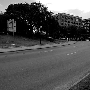
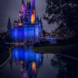
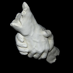
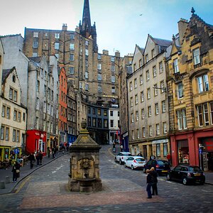
Hi all. New here and to photography. Long story short, got a Nikon D40x as a gift never intending to do anything but take kid pics, then one thing led to another. You know now I'm reading and learning and joining photo forums. Anyway a few of my recent pics for your comments.
autum003.jpg

niftyfifty002.jpg

cabin08128.jpg
 
i think they are a little bit over exposed, try to use your light meter for better exposure. just my 2 cents
 
2nd one I really like especially the reflection :)
 
First one is a little 'grainy', the second is a VERY LITTLE over exposed, and the third is a little blurry. I like all of them though, especially the first two. Can I ask what lens you were taking these with?

Mark
 
Thanks for the comments. The first two are 50mm 1.8 nikor. Third is 18-55mm lens that came with the camera.
 
I like the color and lighting on the first shot, but the composition seems too centered. Don't know what you had to work with, but perhaps having it a little more rectangular might bring more attention to the centered leaf.

I like the 2nd shot but again the ring is pretty close to center. Perhaps more books showing on the right and or a little less white space on the left would be more dramatic.

The third shot is interesting but the background is competing with the main subject.
 
I like the 2nd shot but again the ring is pretty close to center. Perhaps more books showing on the right and or a little less white space on the left would be more dramatic.

i was thinking the same thing, also to slightly close down your aperture so
as to get more of the books in focus.

also u seem to be getting a nice reflection in the table there, i would suggest
playing with that a bit.

The third shot is interesting but the background is competing with the main subject.
i would go for a lower angle and a wide aperture.
that way the surface will fade out of focus in the distance and make your subject
stand out more and create more of a 3d feeling overall.
 
Last edited:
Great shots!

The first does look a little overexposed to me, too... just seems very bright to my eyes, but I'm a noob too, so what do I know? ;)

The second is my fav, but the white on the left is a little distracting. Maybe re-compose, or do something to tone down the white? But I love the colors of the ring and books. And that reflection is very cool.

The third's background makes the pic a little hard to look at.
 
Very helpful, thank you all very much
 

Most reactions

Back
Top