What's new

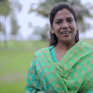
Black an White Portrait

I am not an expert but I really think you nailed it with this. Great lighting, pose and expression, I would be very happy if I took this
 
She is extremely pretty!

Too much vignette, and her skin looks a trifle over-smoothed, but it's a sort of glamorous look. Kind of a modern take on the old school hollywood look.

Not sure I love the pose, but I suspect that shooting from above was a particularly flattering angle for her - her jawline still looks a little massive and my guess is it would be borderline masculine shot from straight on.

I'd like to see a trifle more separation between her and the background all up and down the left side. Your lighting doesn't have the "dramatic!" feel that goes with losing things down in the shadows, to my eye.

These are all minor quibbles, though. Well done.

 
While I agree that the vignetting is too much this is a gorgeous portrait!! Well done!
 
She is extremely pretty!

Too much vignette, and her skin looks a trifle over-smoothed, but it's a sort of glamorous look. Kind of a modern take on the old school hollywood look.

Not sure I love the pose, but I suspect that shooting from above was a particularly flattering angle for her - her jawline still looks a little massive and my guess is it would be borderline masculine shot from straight on.

I'd like to see a trifle more separation between her and the background all up and down the left side. Your lighting doesn't have the "dramatic!" feel that goes with losing things down in the shadows, to my eye.

These are all minor quibbles, though. Well done.


:chatty::chatty::chatty:
 
She is extremely pretty!

Too much vignette, and her skin looks a trifle over-smoothed, but it's a sort of glamorous look. Kind of a modern take on the old school hollywood look.

Not sure I love the pose, but I suspect that shooting from above was a particularly flattering angle for her - her jawline still looks a little massive and my guess is it would be borderline masculine shot from straight on.

I'd like to see a trifle more separation between her and the background all up and down the left side. Your lighting doesn't have the "dramatic!" feel that goes with losing things down in the shadows, to my eye.

These are all minor quibbles, though. Well done.


:chatty::chatty::chatty:

I can tell you that I usually vastly prefer people bringing up minor quibbles on a picture I put up for C&C, as opposed to just a few 'nice shot!' type comments and then falling like a rock to the bottom.

I'd have liked to have seen her head tilted just slightly to the picture's left (her right). Not even sure it would have been better, but her head placement is perhaps the only thing that I'm not 100% sure about. Agree with the slightly too much with the vignette. Overall great shot though.
 
Face, hair and bodice all good lighting. Shadow on backdrop spoils it. If you do this again, try to get the backlight to cover more area so to eliminate the shadow and define the hair better.
 
It's great to see you dabbling in other areas of photography Rich. Keep it up, this is a great shot. :thumbup:

The first thing I noticed and only major complaint is the shadow, I'd like to see that eliminated.
 

Create an account or login to comment

You must be a member in order to leave a comment

Create account

Create an account on our community. It's easy!

Log in

Already have an account? Log in here.

New Topics

Back
Top Bottom