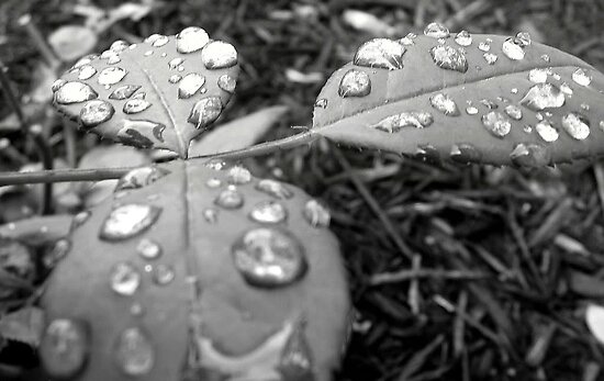
This basic photo has been done a lot, for years. Technically, I think this example needs some work...the highlights are blown out, the midtones are very one-dimensional, and there's a rather extreme heavy vignette added to the edges. Also, there doesn't appear to be a good,dominant point of interest, and it looks like there's a little bit of wind motion blur on the leaf on the right hand side. This particular camera point of view and focusing choice does not seem to bring everything together. The large amount of OOF leaf on the left hand side is distracting, and the big empty spot in the center is where my eye sort of loses its place and zips right to the background.





![[No title]](/data/xfmg/thumbnail/40/40306-ea393f71adcd88a9abb9fb16dc6af2d5.jpg?1734174714)
![[No title]](/data/xfmg/thumbnail/41/41797-ed370d68dae70f5b0a7252ec2d525912.jpg?1734176109)


![[No title]](/data/xfmg/thumbnail/41/41799-fe172a668fba7717bf773664387d64aa.jpg?1734176110)