If you post several dissimilar images, it is unlikely you will get good constructive c/c on all of them; it's just too much work.
And, if you do post several, number them.
And I suggest allowing editing, you will get better more complete responses.
OK, let's pick one.
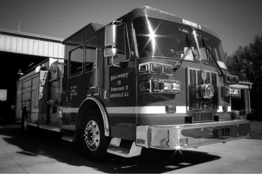
#2 is a picture of a firetruck, bright red, but in b&w thus losing a lot of impact for no obvious reason. It's a big powerful truck but showing it in this way is, unfortunately a cliche.
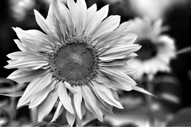
#3 is a detailed up-close view of a flower, OK but nothing original.
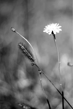
#1 shows some real effort to actually make a picture.
Good try, very interesting background but some weakness in composition and exposure.
There are three stalks at odd angles coming into the picture, each one leading to what might be the primary center of interest, but its not clear which you want me to look at.
The littlest one doesn't have much detail, the bigger one has a lot of detail but the white flower is so bright is pulls my eye - but its blown out, overexposed and fuzzy.
When you chose to have multiple centers of interest, they need to relate to each other in some sensible, meaningful way, otherwise the viewers' eyes just go from one to the other.
If you have multiple items that could be the center of interest, it has to be clear which one you are looking at as the important one.
When you look at your subject, first figure out what you want us to look at, then expose and compose around that.
If you don't know exactly what you think is important then the viewer won't know.
As it is, it's a really good start, I love the background and the attempt but, as it is, it is incoherent.




![[No title]](/data/xfmg/thumbnail/32/32943-1a3c3a399438cf2fc6a21415e9bdedcf.jpg?1734162774)





![[No title]](/data/xfmg/thumbnail/37/37126-93feffeca0e9e6ad893962c03a7a341e.jpg?1734169833)

![[No title]](/data/xfmg/thumbnail/32/32007-77c44b6b6edb5db977381096a2ffe54b.jpg?1734160805)