Blue & Orange Abstracts (BESP - P2)

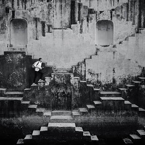
But since it has come up, The statement pertaining to abstract was.....poorly placed for lack of a better phrase. One does not need to create abstract art to use lines nor does the image need to be representational. You are right, lines are everywhere and can be used in a couple different ways artistically. Artistic does not necessarily make or require the image to be abstract.

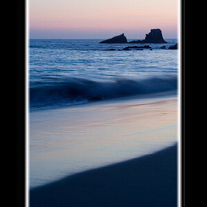
I am enjoying this conversation, but I may be missing your point. I understand exactly what you are saying, but not sure how to apply it to the conversation, or this project. The project was to take two non-representational, abstract images comprimised of line.
 
I dont understand what was confusing. Even though my first two were not what they should have been, i completely understood the assignment. I just couldnt get my imagination to cooperate!
I think maybe everyone got more hung up on trying to shoot lines, that they almost forgot about how important the abstract part was......That happened to me. I even kept going back and reading the assignment to remind myself of just what i was trying to accomplish. I was taking pictures of everything i could find that had more than just a straight line....It was only after i uploaded them and started trying to pick the ones i liked best that i would realize they were not abstract at all.


Now for C&C...your original entires were just what they were (again, just like my first two).
The second two i actually really like. They may not be as abstract as they need to be, but i like how you tried to capture different types of lines and not just straight, round, or angled lines. We can tell that you were at least working in the right direction to a certain extent. I would guess you kept asking yourself "what would be less boring"....And i think the second two are great improvements!
#1 is distracting in the background because of the blurry bright colors. I think if they werent so bright it would work a little better. But i do love the round lines.
#2 is simple to a certain degree..but at least you got some lines that we dont see every where we look. And i like the reflections.
Both are pretty much centered....im not sure if that counts off or not with this assignment. Im happy with things being centered so thats something im trying to break myself from doing..Therefore, i notice it more!
And even though i think you cheated (heehee)..Its good to see that you went back and tried again. I think thats important here. When we see how we can improve, we should go for it!
 
The first is my favorite. The colors are great, the subject is interesting, definately abstract IMO. I don't have any nits beside what appears to be sensor dust top left. Good job!

The second appears to be a cork screw. I still think it's an interesting composition. I'm not really a fan of the grey background, but I don't know if anything else would fit the photo any better.
 
Last edited:
#1 has great colors and a nice solid interesection right in the middle. It works for me.

#2 doesn't. The lacking colors and that fact that I can quickly identify what it is turns this into a pretty boring shot in my humble opinion. The lines don't interest me.
 
... <snip> ... Now for C&C...<snip>... #1 is distracting in the background because of the blurry bright colors. I think if they werent so bright it would work a little better. But i do love the round lines...<snip>...
I was going for turbulence left in the wash, as it were. I wasn't pleased with the solid background colors, so I took one of my tye-dyed tee shirts and wrapped it around the boom arm of the light stand. I also gelled the flash with a full CTO and bounced it off a rear wall that is a burnt-orange color to get the color of the whisk.

...<snip>... I'm not really a fan of the grey background, but I don't know if anything else would fit the photo any better.
I felt the grey background worked as the family of color appears several times. Thanks.

...<snip>... #2 doesn't. The lacking colors and that fact that I can quickly identify what it is turns this into a pretty boring shot in my humble opinion. The lines don't interest me.
MINI-CHALLANGE!!!

Have at it, my son. Do me one better. :mrgreen:
 
bump.jpg


I know........ shameless, isn't it?​
 

Most reactions

Back
Top