What's new

Boarder and Logo attempt...

WolfSpring

TPF Noob!
Joined
Oct 11, 2007
Messages
159
Reaction score
0
Can others edit my Photos
Photos OK to edit
I used gimp to try and do a boarder and Logo on a photo, it's a nature photo, but it's a general catagory edit IMO. If I'm wrong feel free to move it mods :). I'm new to PP photos, all I really know how to do is crop, and auto correct, and very little about layers with magnetic lasso.
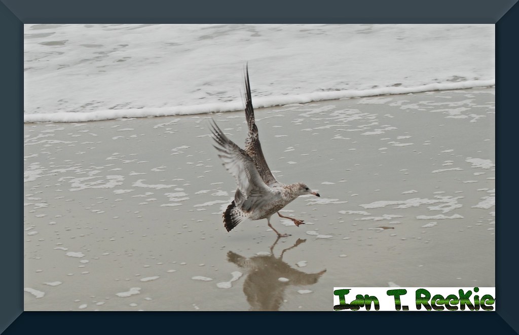
1800759263_218a11ed8f_b.jpg


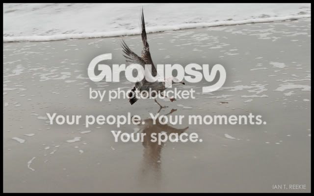
The seagull was coming in for landing to eat the shrimp, he actually let me get some of him with the shrimp in his mouth I will post later. Crummy day of overcast, color was horid and I'm not the best photog in the world, but any advice on how to do the boarder better, or how to get the logo so it is just the letters and not a background using GIMP would be appreciated. TY.
 
The seagull landing on the wet sand is nice, pity about the clipped off part of its reflection but that little mistake would certainly happened to me, too! It is very centered, so I think I would have looked into a different crop of the image in order to move the gull a bit further to the left.

As to the ready-made border ... that's a matter of taste, really, I personally don't like those that resemble a real border (3-D effect and all), I like borders around photos as a finishing touch but prefer my PS-created flat ones. The colour of the border you chose is nowhere there in the photo, so I feel it is forced upon this photo and doesn't help it at all. It distracts immensely.

More so does that big, fat, green, wrapped-into-white signature. That one ruins the photo (in the way you are presenting it here). It is too massive, too prominent, too green (says I, imagine! ;) :D) ... I prefer them small, subtle, and always taking up a colour that already is there in the photo as such.
 
All that makes perfect sense to me. I'm still trying this boarder thing. I've just seen alot of pictures with boarders and they look so professional. As far as the crop and reflection yeah it was a bad choice of where to crop now that I look at it, thats why I hate PP my shots, but it's something I need to learn. The original shot was centered a little better and the reflection was complete. I was "forcing" the boarder as you said, it just was so aggrevating kand I am impatient with PP programs. here is the origianl image:

DSC_0621.jpg


Thanks for the opinion it is greatly appreciated and I will try something else. As far as the signature, I'm trying to work more on a "trademark" to use something incorporating my initials or something. I'm still pretty new at this and have a lot of room and time to grow, I'll get it right in time. Thank you. :)
 
Here's my take... hope you don't mind me editing it:

DSC_0621.jpg


Cropping a little higher might have been an improvement, but i cant be asked now.

So, what'd ya think?
 
Very nice, now did you actually put a boarder on it? Or did you change the canvas size allowing a bigger canvas?
 
Nah, i cropped slightly too wide and used the pencil tool to literally draw it in. Hold shift while you're doing it and it draws a perfectly straight line. Not sure if this is the most effective way, but it's how i do it.

Looking back at the picture, it looks like the hardness on the pencil was pretty low... there's a white edge to it which i didn't mean to put there.
 
heres my go, hope u don't mind me editing it. i also did'nt know if u wanted the bored solid or a art type so i did a art type figure and also saturated the image a bit with a minor crop.


Thanks for the ideas, when I get some time I'll work on boarders some more. :wink:
 

Create an account or login to comment

You must be a member in order to leave a comment

Create account

Create an account on our community. It's easy!

Log in

Already have an account? Log in here.

Back
Top Bottom