1. I missed the rings entirely at first and wondered what you were doing. I like the idea of it and the leading line, however the placement and the angle aren't so hot.
2. is my favorite, but then I am a huge Beckstead fan, so...
3. is lovely. Focus landed on the bouquet.
4. The bannister and stairs are causing some distraction issues. I love her dreamy look in this one.
5. Nice. I'd do a little opaque cloning over the armpit. It's really dark and a draw.
6.Lovely shot and pose. There are distractions next to her head. She's a bit orangey.
7. Nice. Bit uncomfortable looking and I wish it were a full shot of the dress front.
8. There is too much DOF in this one. She's kind of lost and the mansion takes over.
9. The mansion grows out of her head. She would have been better placed to our right in front of the shrubbery and a bit of a wider angle. This will not print well to any standard size.
10. You need to learn to minimize distractions. The fireplace, the partly opened drapery and the piano partly in the image take from it. They would have been fine had you given them less importance and moved her away from the piano, used a wide aperture. Your wide angle makes the fireplace look like it's leaning to our right and the piano leans to the bottom left. There appears to be junk on the mantle. There is no detail in the dress and a lot going on with the top of the piano as well. Too many things at one time. The candelabra that is lit in the full light of day and looks odd is competing with your bride for attention at the head.
 2
2 3
3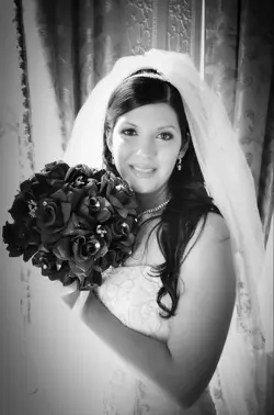 4
4 5
5 6
6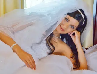 7
7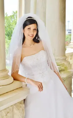 8
8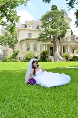 9
9 10
10
 2
2 3
3 4
4 5
5 6
6 7
7 8
8 9
9 10
10


![[No title]](/data/xfmg/thumbnail/32/32183-06800ba86381f42976d75297ee6b5942.jpg?1734161047)


