What's new

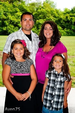
Brother and family c+c please

ayen75

TPF Noob!
Joined
Apr 2, 2012
Messages
19
Reaction score
0
$image-1390045974.webp
 
Its cute, but the lighting is off..the background looks like a picture..
 
Do I not want my subject to stand out from the background? I'm new so just asking
 
There are three major things wrong with this, imo.

The family is posed very awkwardly and straight
The lighting on the family is way too even and generally uninteresting
The background is too bright, too in focus and too intrusive. (they look pasted on)

Lew
 
In my opinion, you want to have the people match the light in the background..so it looks natural, but you have to be careful so that you dont get weird shadows or ghostly people. I am sure someone with more experience can explain it better.
 
The way the concrete goes straight at about their waist makes the green look like another photo. It doesn't blend well... I think that's what the poster above was talking about.
 
Good-looking family! I think the pose is fine, sometimes you do a tight, formal shot, and other times you have them posed more casually. My problem is with the lighting. It appears that you used the on-camera flash, but what that did was to flatten the light. Please try this again, using the flash off camera, or simply for fill flash, if it is on the camera. So you need the main light coming from a reflector or another light off camera. Try to get the light to "model" their features, with some highlights and shadow (not harsh light, nor deep shadow either).

 
Do I not want my subject to stand out from the background? I'm new so just asking

Yes, naturally you want the main subject to be differentiated from the background, but I am wondering if you did any post-processing on this to "sharpen" the outlines?
 

Create an account or login to comment

You must be a member in order to leave a comment

Create account

Create an account on our community. It's easy!

Log in

Already have an account? Log in here.

New Topics

Back
Top Bottom