What's new

Building Portfolio, need to be critiqued.

petahsumething

TPF Noob!
Joined
Oct 2, 2010
Messages
9
Reaction score
0
Location
Canada
Can others edit my Photos
Photos NOT OK to edit
DSC_0841.jpg

#1

DSC_0839.jpg

#2
DSC_0805.jpg

#3
DSC_0696.jpg

#4
DSC_0573.jpg

#5
DSC_0578.jpg

#6
DSC_0036.jpg

#7
DSC_0262.jpg

#8
DSC_0766.jpg

#9
DSC_0473.jpg

#10
DSC_0922.jpg

#11
DSC_0966.jpg

#12
DSC_0970.jpg

#13


Please let me know how I can improve these pictures. How many of the 13 shots are great for my portfolio. Thanks in advance!
 
Last edited:
none of them are really screaming 'hire me' or interesting enough to keep me from moving on to the next one on the list to only move onto the next...sorry...

sorry if i cant be more constructive. haven't slept yet. maybe later when im rested..
 
i think #12 and #9 is good. All the other one have blown out skies, cropped body parts, under exposed and are OOF.
 
i think #12 and #9 is good. All the other one have blown out skies, cropped body parts, under exposed and are OOF.

What do you mean cropped body parts? in every shot, is it better to have entire in the picture? and what does OOF mean? thanks
 
i think #12 and #9 is good. All the other one have blown out skies, cropped body parts, under exposed and are OOF.

What do you mean cropped body parts? in every shot, is it better to have entire in the picture? and what does OOF mean? thanks

OOF means out of focus, some of them look soft a little bit. Probably from camera shake.

Cropping body parts sometimes works, sometimes it dont. I do that sometimes and ruins some good shot.....especially when i cut people feets at the ankles hahaha
 
Please number the pictures, especially since there are so many of them. The only one I really like is the first one of the singer.
 
If they were mine I wouldn't use any in my portfolio, sorry for being harsh. Some of the pictures have great potential but just aren't composed well. The daylight ones are far to over exposed and the focus is off. The performance ones are okay but not as energetic as ones I'm sure you could've got.
 
If they were mine I wouldn't use any in my portfolio, sorry for being harsh. Some of the pictures have great potential but just aren't composed well. The daylight ones are far to over exposed and the focus is off. The performance ones are okay but not as energetic as ones I'm sure you could've got.


This.


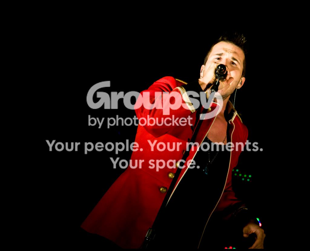
BUT, I do like the second one of just the teeth.
 
the exposure is too much on the kids pictures. You need to start using flash.
 
the last one of the kid is not bad...

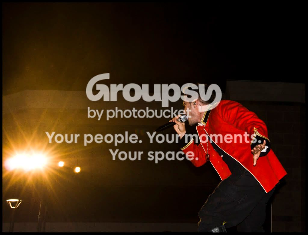
the first one of the singer could be cool if the frame was shifted down a bit...

really depends on what this portfolio is for... if it's just to show your shots, then great!... we all have a selection of our best shots that we keep improving upon...

if it's to get hired as a music photographer or portrait photographer, then you probably need more work and learning. this isn't supposed to be a dig at you or anything...

we all start somewhere, and we're all trying to learn. this is a beginners forum after all...
 
I wouldn't use any of these in my portfolio, personally. The photos of the kids really don't work for me--too soft, not enough fill light. Nothing really sparks my interest or looks professional quality. Sorry :(
 
If these shots are to be part of your portfolio, then let’s look at the purpose of a portfolio. As a marketing document, it has a specific audience in mind, and should be designed to appeal to and influence that audience. In practice, you would have different portfolios for different audiences. In any portfolio, you need to demonstrate that you know the “tricks of the trade” (technical skill) for the specific type of photography you’re doing, and also highlight some unique angle that makes you more desirable than the next photographer. For any marketing document, there has to be a “Wow” factor that speaks directly to the target audience, and engages the emotion.

With that preamble in mind, what IS your target audience for these photographs?

My critique is as follows:
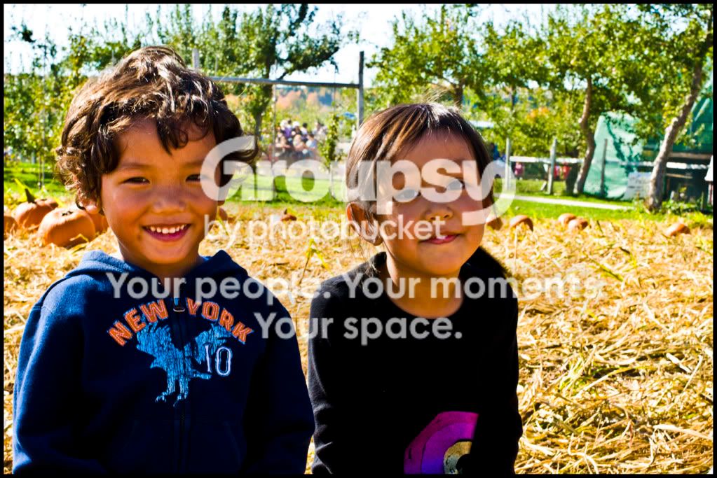
1) Cute kids, but there’s too much background, and not enough separation between the subjects and the background.
2) Can’t see the eyes. Shadows on the face are not contributing to the image. Bright OOF area at lower left keeps pulling eye away from the face.
3) Good exposure, but the framing needs less space on the left and more on the right. It looks like the pumpkin is so heavy that he needs the support from the picture frame to hold it up…
4) Not much going on here, unless you’re selling kids hoodies. Light’s too harsh and the shadows need some fill. Coming back to the idea of the portfolio, what is there about this image that would attract a prospective client?
5) Not bad. Would have been stronger if you shot from the kid’s eye perspective. Also, having legs behind the kid doesn’t contribute.
6) Close, but not there yet. Low shot looking up works, but the focus appears to be on the sweatshirt, and not the kid as you’ve removed the top of his head. Again, legs in the background are distracting.
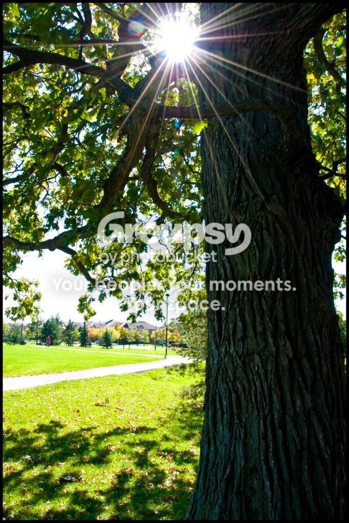
7) Sun rays are good, but there’s really nothing else compelling about this shot.
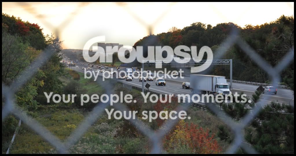
8) Chainlink fence as out-of-focus foreground has potential, but the blown sky and darkish middle-ground don’t work very well. If you are going to use the fence, it needs to contribute in some way – are you fencing something in or out? What’s the connection between it and the rest of the picture? What’s there about the image that would make an audience care?
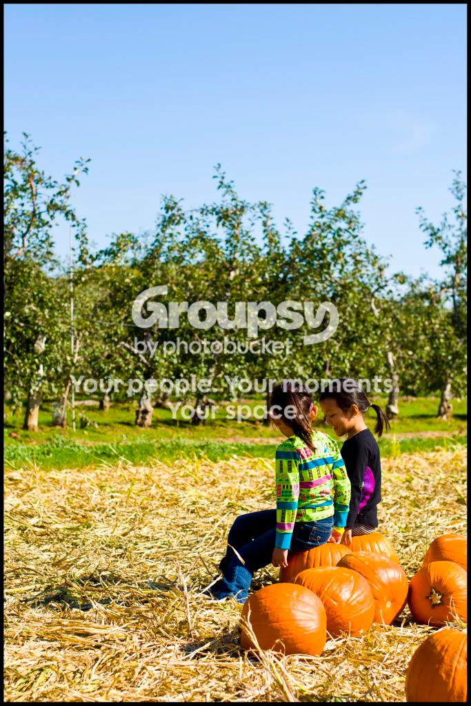
9) As a snapshot, this is nice. As a portfolio picture, it lacks focus. If the intent was to highlight the kids sitting on the pumpkins, then the background has to be simplified (either by a different angle, a lower angle, or by using a wide-open aperture, etc.).
10) Nice shot of baby’s face, but too dark, and again, the framing has to be better, as the out-of-focus chin in the upper right part doesn’t help. Eyes are clear and sharp, there are catchlights to give them definition, and the side-light works.
11) Concert shot – Can’t see the singer’s face, and posture isn’t very compelling as an image. Those bright lights on the left are distracting. It looks like you got a flash shot, but the flash reflection (on jaw, button on shirt, top of boot) isn’t helping.
12) Light’s a little hot on the face, but the sin here is that the singer’s face is obstructed by his mike. Yes, you do want to see a singer singing into the mike, but you want some separation between the person and the mike.
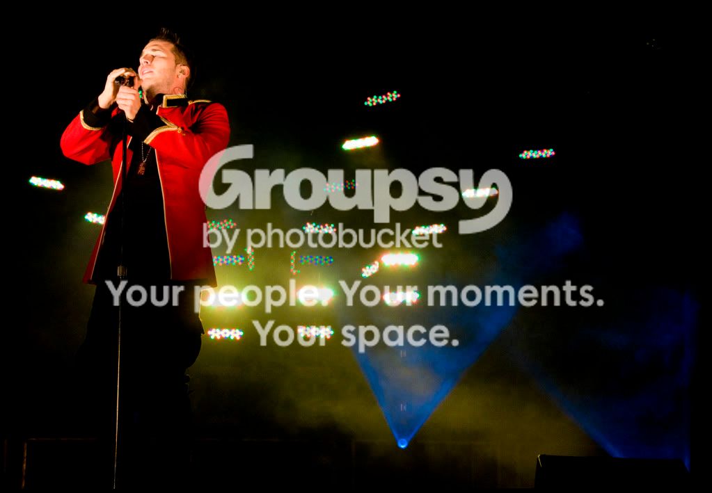
13) The light on the face is somewhat hot. Can’t see his eyes, and the singer is not very sharp. I know, I know, it was dark, with uneven light and he was moving all over, but that’s why really good concert photography is difficult to do even with good equipment.

My take-away from this is that you need to think carefully about who your portfolio will appeal to, and the type of images that your target audience is expecting or wanting. Then, you need to select the photos that allow you to deliver on that expectation.

 
Last edited:
I would add that the post processing on most of the images with the children is pretty bad, IMHO. You might want to work on that, along with your composition. Try using a flash to get your subjects to stand out more with better color and detail. Also work on your focus, several of these are soft or OOF.
I don't think you're ready to be building a portfolio, you should instead focus on mastering photography - then worry about a portfolio.
 
#4 Would be a great picture, if you didn't cut off the top of her head. Remove the legs from #5, and it would be a lot better, I would maybe make a black and white or sepia, or a little vintage looking version of this one too, but only if you get rid of the legs behind him. #7 is neat. I like #9, and #11 if you made it a little less flat would be good too. These may not have made my jaw drop, but they are good and have potential, so those would be my picks for the portfolio after some tweaks. :)
 

Create an account or login to comment

You must be a member in order to leave a comment

Create account

Create an account on our community. It's easy!

Log in

Already have an account? Log in here.

New Topics

Back
Top Bottom