What's new

C&C - Christmas Card Shots

tevo

Recovering TPF Junkie
Joined
Nov 19, 2010
Messages
2,507
Reaction score
440
Location
San Jose, CA
Can others edit my Photos
Photos OK to edit
I was approached by a friend of mine to take pictures of him and his girlfriend to send out in a Christmas card. Here are a few from the shoot, C&C is very much appreciated, as I am very new to portraiture.

EDIT: Fixed the atrocious green tint, my intention was not to make my models look seasick :drool2:

#1

Jeff and Chloe by theofficialtevo, on Flickr

#2
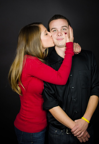
Jeff and Chloe by theofficialtevo, on Flickr

#3
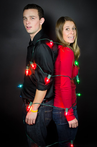
Jeff and Chloe by theofficialtevo, on Flickr

#4
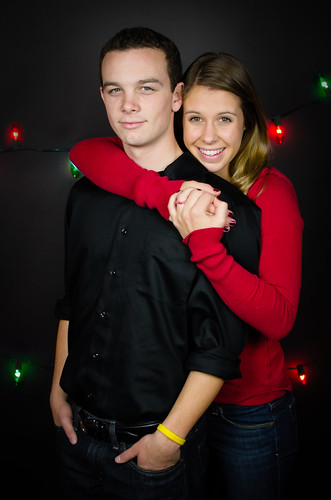
Jeff and Chloe by theofficialtevo, on Flickr

#5

Jeff and Chloe by theofficialtevo, on Flickr
 
Last edited:
#4 looks okay. ALL of these have a LOT of green in the skin tones...that needs to be dealt with one way or another. Add some SERIOUS magenta to the yellows in selective color and see if that will help.
 
#4 looks okay. ALL of these have a LOT of green in the skin tones...that needs to be dealt with one way or another. Add some SERIOUS magenta to the yellows in selective color and see if that will help.

Wow... good eye. Lightroom defaulted to -5 tint for some weird reason, and now that I look carefully you are absolutely right. Fixing now.
 
Derrel you just saved my ass. Does this look better?

Edit: OP edited.
 
Last edited:
I think 4 is really cute. Skin looks good to me!
 
I'm on a kick to tell people, not only why I like one the most but also why I like the others less.

#1 They're two individuals pushed close together, no closeness showing
#2 she's kissing him, he's not engaged (note clasped hands), smirky smile. tech issues, brightness of face, yellow wristband draws the eye.
#3 tied together, no displayed closeness, not funny, just odd.
#5 Expressions and color good but all the 'good' stuff too close to the top.
#4 best of all, he's comfy, she has great smile good expressions and closeness, his pose is complete and at ease, they both look happy and good.
 
I'm on a kick to tell people, not only why I like one the most but also why I like the others less.

#1 They're two individuals pushed close together, no closeness showing
#2 she's kissing him, he's not engaged (note clasped hands), smirky smile. tech issues, brightness of face, yellow wristband draws the eye.
#3 tied together, no displayed closeness, not funny, just odd.
#5 Expressions and color good but all the 'good' stuff too close to the top.
#4 best of all, he's comfy, she has great smile good expressions and closeness, his pose is complete and at ease, they both look happy and good.

Thank you very much for the advice, Lew. My biggest struggle with portraiture so far has been how to pose my models, so this is a big help. I need to re-read that photo camel article I see floating around here periodically. #2 actually was not posed, it was between poses and she leaned over and kissed him, so I grabbed it. I missed focus slightly, unfortunately :grumpy:. Also, the yellow Livestrong bracelet was requested to remain on by my model, against my better judgement (I think it has some sentimental value or something to him). I do know as a rule of thumb that jewelry and flair such as that should be removed.
 
If you really want to play with this, you might darken his face a bit so that his and hers are closer in tone and darken her hand also.

8302710013_a29105a12c_odual_zps010ba7ac.jpg
 
If you really want to play with this, you might darken his face a bit so that his and hers are closer in tone and darken her hand also.

8302710013_a29105a12c_odual_zps010ba7ac.jpg

Normally I would have gone through and retouched the skin tone / brightness / etc but I was somewhat pressed for time on these. The only real processing I did to these was a contrast, saturation, and luminance NR adjustment.
 
Tevo, these do look better now than they did last night, yes. You have removed the majority of the greenish tone that was polluting the skintones. But there is still a bit of yellow/green undertone to the skin-tones that still lingers....mostly visible on the woman's skin. The_Traveler's rundown on the plusses and minuses of the shots is excellent; his ideas are very savvy. As he pointed out, shot #4 is the clear "winner" out of all the photos.
 
Tevo, these do look better now than they did last night, yes. You have removed the majority of the greenish tone that was polluting the skintones. But there is still a bit of yellow/green undertone to the skin-tones that still lingers....mostly visible on the woman's skin. The_Traveler's rundown on the plusses and minuses of the shots is excellent; his ideas are very savvy. As he pointed out, shot #4 is the clear "winner" out of all the photos.

What would be the best way to remedy this? I'm not entirely sure what caused it, as all the SOOC shots have this greenish yellow tint to them for no apparent reason.
 

Create an account or login to comment

You must be a member in order to leave a comment

Create account

Create an account on our community. It's easy!

Log in

Already have an account? Log in here.

New Topics

Back
Top Bottom