Good & bad.
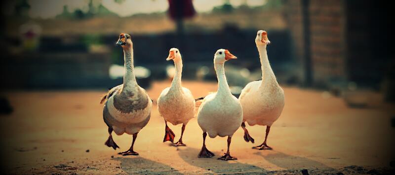
I love #2. There's no rule of thirds and I don't care. The vignetting is strong -- also don't care. People will pick on those points but there are always times when you get to break the rules. In #2 I see subject isolation by both selective focus and selective lighting. The photo tells a story. These guys look ilk they're coming home from a day at the swim hole -- it doesn't matter what they're really doing, you've caught them with the right shutter speed to show that they're strolling back home from somewhere (or maybe they're on their way out to somewhere.) Lighting is nice - maybe just a touch hot in a few places but calming that down would have made them too dark in front -or- you'd have to use a weak flash contribution to fill in. In any case, I love the shot!
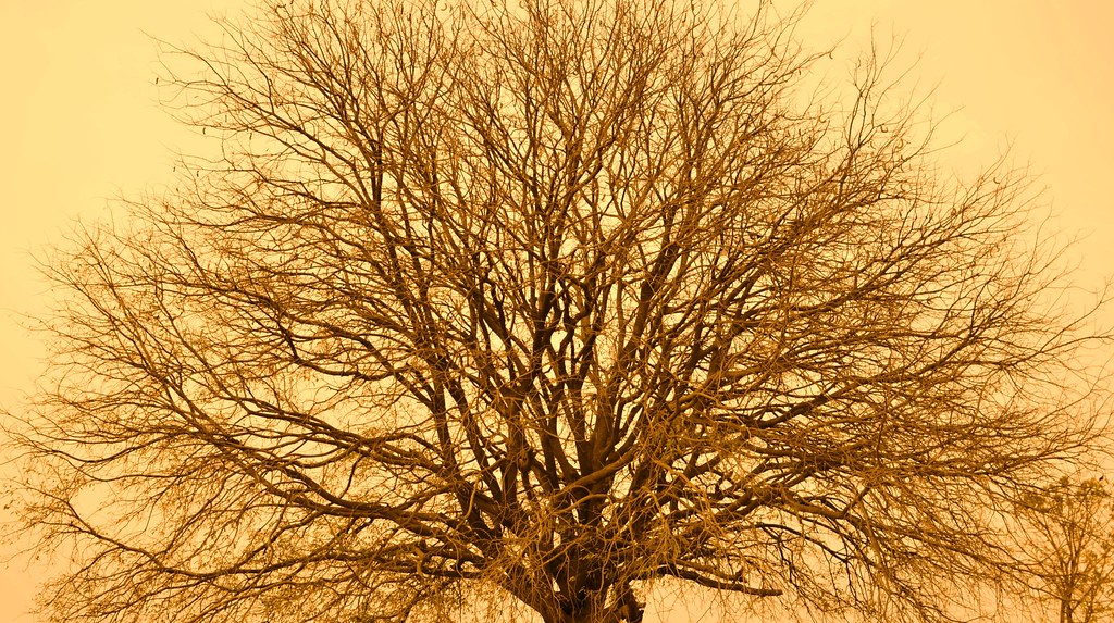
#1... not so much. I'm looking at this and I'm wondering how you want me to connect to this. What am I looking at? Sure it's a tree. It's just sort of an indiscriminate crop of the top of the tree. I'm not so close that I can see any juicy details. And yet the tree isn't "grounded" in anyway. There's no anchor. Nothing is happening in the tree. The lines aren't leading me to some focal point of interest in the image.
You've got a sepia treatment applied. Actually it looks like you've heavily warmed up both of these images. It works with the geese because the effect specifically adds to the image. It suggests warmness and sunset (or maybe it's very early morning sunrise.) In any case, you can get away with it because this effect specifically adds to the image... it's an ingredient in the overall visual-meal that we can taste.
But in the second shot, it's just a sepia treatment. I don't see a particular reason to add it. When people convert photos to black & white, I usually ask them why. I'm not looking for a right or wrong answer -- I'm wondering if what THEIR motivation was for doing it. If they're doing it just because it seems to be the latest "in thing"... that's not a reason I'm looking for.
So in #1, I'd ask you... why did you take that shot? Why did you decide to crop it that way? What were you trying to convey or what did you see that made you think of this as compelling. Why did you apply a sepia treatment to it? In music, if an artist adds notes to a chord, there's a reason they added notes and more importantly, there's a reason they added the very specific notes they choose to use - not just any random notes would have done. Photography is a bit similar. The sepia treatment (essentially an orange) has color balance when combined with blue or green. These create a color balance that's pleasing to the eye. But as a monochrome the color doesn't help unless it were there to suggest age -- but the tree isn't shot in such a way as to suggest age or being ancient.
Connect with it and help ME connect with it. You did that in #2. The geese cause me to think about how people behave -- there's even some humor in the shot and each of the treatments, the cropping, composition, focus, lighting, vignette, and tinting, all "add" to this in ways that help tell a story, convey some feelings, and make me connect with it. But in #1... I'm looking at random branches on the top of a tree that isn't anchored and there's no connection here. Monochrome images can eliminate the distraction of colors if they have something interesting to show off -- and usually that will be in contrast, texture, structure, patterns, or something else that might be captivating. I could imagine using the structure of the tree branches as the basis for a double exposure -- superimposing something else where the patterns of the lines would add to an overall image.
Your exposures are fine. Your focus seems sharp (as well as I can see in these sizes). You've got the basics working for you. In #2 you've got composition working for you -- just not in #1. You might be interested in "The Photographer's Eye" by Michael Freeman. This book is mostly about compositional elements that go into a great photograph and how to think about them.


 . Thanks in advance. Cheers.