joylyn
TPF Noob!
- Joined
- Jan 1, 2013
- Messages
- 94
- Reaction score
- 17
- Location
- United States
- Can others edit my Photos
- Photos OK to edit
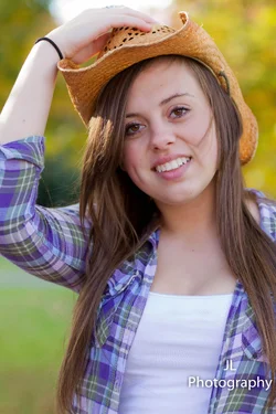
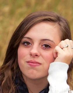
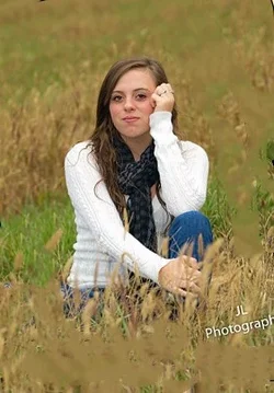
Not bad! The second looks like it has been sharpened a lot.
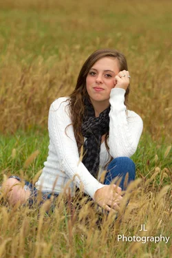
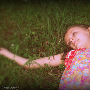
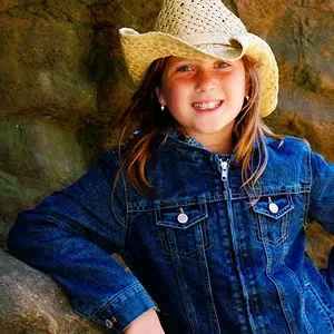
The second's composition is kind of an awkward in between. I say go tighter or wider, either have her filling the frame or some space all the way around her.
WB seems a bit off, not necessarily unpleasant in either, but if you were to sell these to the client, you'd want consistency.


Again ty you both very muchBut the consistency thing has me abit confused because of the fact that it was 2 different days and weather was not the same so how am I to keep them consistent? Also Charlie I guess its my monitor but your version looks more yellow then mine? I have calibrated my monitor found a link on google that walked me thru .
View attachment 31802I did not like the lean in the first image and also the boot that shows to the left
View attachment 31804
This is my very rough and quick to give you an idea.
Joylynn... compare the skin tones between the two. While her face is in shadow in #2 from the hat... she should still match the non-shaded shot closer. #2 looks a little cyan to me.... and #1 may be a touch yellow. I am on my work monitors, and they have not been calibrated in quite a while, so I could be off. Try the Skin Tone by Numbers that I mentioned... you might find it helpful. As Jess mentioned, these do look oversharpened.
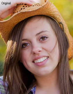
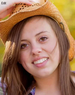
Colors on #2 Edit (difference is subtle, but noticeable)
View attachment 31686View attachment 31687
Also.. always watch expressions on your models. Direct them a little bit if you need to. I feel the expression in #1 is not really flattering. You have your dof and focus down pretty well. #2 is nice, expression wise! Composition and posing needs some work.. as does your post (as we discussed).
Start using that gray card you said you were going to get... try setting a custom white balance for every session until you start to really get the hang of it. Don't forget reflectors or fill flash (just a touch of fill flash would have warmed up #2 a little bit). Watch your framing...#1 would be impossible to print and frame as it.. her knee would be cut off. #2.. yes.. elbow!
Just keep practicing!![]()
Joylynn... compare the skin tones between the two. While her face is in shadow in #2 from the hat... she should still match the non-shaded shot closer. #2 looks a little cyan to me.... and #1 may be a touch yellow. I am on my work monitors, and they have not been calibrated in quite a while, so I could be off. Try the Skin Tone by Numbers that I mentioned... you might find it helpful. As Jess mentioned, these do look oversharpened.
Colors on #2 Edit (difference is subtle, but noticeable)
Also.. always watch expressions on your models. Direct them a little bit if you need to. I feel the expression in #1 is not really flattering. You have your dof and focus down pretty well. #2 is nice, expression wise! Composition and posing needs some work.. as does your post (as we discussed).
Start using that gray card you said you were going to get... try setting a custom white balance for every session until you start to really get the hang of it. Don't forget reflectors or fill flash (just a touch of fill flash would have warmed up #2 a little bit). Watch your framing...#1 would be impossible to print and frame as it.. her knee would be cut off. #2.. yes.. elbow!
Just keep practicing!![]()
Charlie where do you mention the skin tone numbers? I would be interested in that information![]()