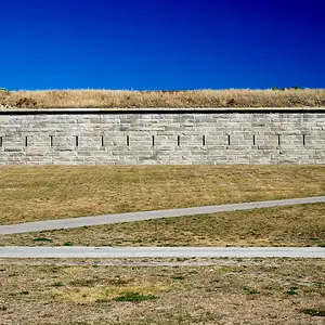
Well, if it weren't for the too green grass

shock: did
I just say that something is "too green" ?!?!?!?!?!?), I would much prefer the original version to your colour-manipulated one! Saturation is overboard in the one you linked to here only, though.





![[No title]](/data/xfmg/thumbnail/30/30986-0fbf9af8f70b46ce37aeb237ba68b573.jpg?1734159039)
![[No title]](/data/xfmg/thumbnail/38/38263-ad5e4c9e677626ddb5b1e7cdf9ebe40e.jpg?1734172152)