TerribleWone
TPF Noob!
- Joined
- Dec 29, 2010
- Messages
- 40
- Reaction score
- 0
- Can others edit my Photos
- Photos OK to edit
Hey guys I have been trying to avoid buying a spyder3 as I want to have the money to pick up a new lens. For the most part I have not had many issues with printing since I have done a pretty decent job doing my own color profiling on my editing machine. I realize that my images will look different on many others LCDs but I would like to double check the issue I am having on my laptop is specific to its screen and not the photo. I specifically talking about what I would describe to be the color temperature of the screen. I noticed that in some of my photos the color cast has a slight blue to it on my laptop (not profiled) when on my PC the photos look spot on white balance wise.
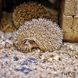
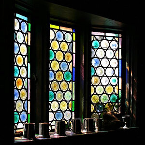
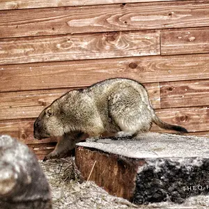
I have arranged these images in order of what I feel is best to worst color cast. The top one looks perfect on both the PC and the Laptop, while the lower two look great on the PC but appear to be a bit more blue on the LP.


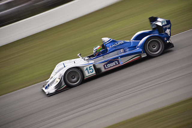
Just out of quick interest, any opinions on contrast? When reprofiling my PC I upped the contrast on the screen to prevent me from pushing my pictures with hard contrast. I did this since when they were printed they came out with more contrast than my screen. I then made several prints and continued to lower the contrast until it matched my prints. At this point I have my PC looking pretty close to what i seen on the OLD screens on a Ipad or Itouch.
Anyways The top shot looks good on my PC and the lower one looks way too overdone as it was edited on the lap top.

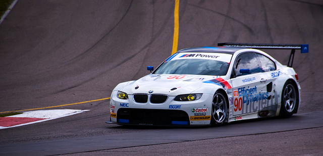
Anyways any comments as to what looks proper would be excellent. I am just trying to insure my web images look proper before I go about editing anymore.
I have arranged these images in order of what I feel is best to worst color cast. The top one looks perfect on both the PC and the Laptop, while the lower two look great on the PC but appear to be a bit more blue on the LP.
Just out of quick interest, any opinions on contrast? When reprofiling my PC I upped the contrast on the screen to prevent me from pushing my pictures with hard contrast. I did this since when they were printed they came out with more contrast than my screen. I then made several prints and continued to lower the contrast until it matched my prints. At this point I have my PC looking pretty close to what i seen on the OLD screens on a Ipad or Itouch.
Anyways The top shot looks good on my PC and the lower one looks way too overdone as it was edited on the lap top.
Anyways any comments as to what looks proper would be excellent. I am just trying to insure my web images look proper before I go about editing anymore.








![[No title]](/data/xfmg/thumbnail/39/39657-59afb9b38e439b33906e81e4952470ac.jpg?1734173973)