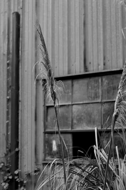
This photo lacks a clear and compelling center of interest, and it is also a failure as a "scene". The image has several things that compete for attention: the black post or whatever on the left of the frame is a strong, yet out of focus element. The multi-pane barn window with the one broken out window draws the eye to a literal "black hole" on the OOF background. The tall grassy plant that is shown in the foreground??? "Ehhh..." It is off-center and holds very little visual interest. its counterpart, the grass stalk that heads out of the frame on the right hand side? Again, "ehhhh..." The tonal values? Lots of muddy middle-gray. Very flat, dull,uninteresting rendering of the tones in the scene. I'm not trying to be obnoxious or flippant, but this is a lousy photo, unless the goal is to show how NOT to create a good photo. This photo is actually a really,really badly-composed and badly rendered shot of this scene. As a web-sized image, it holds absolutely no fascination for me; the information it shows is very small...perhaps the grass stalks are saw-toothed and fascinating at a macro-level view, but as-shown, I could not possibly care less.
This photo seems to be the kind of chain-yanking effort a smart, intellectual-type person,like yourself, might post in an effort to prove some type of disingenuous "point". Do I smell a rat??????
A second line of thought: this is what I call a "web reduction"...it is a very small image...it might look decent if printed so that it showed us at least "something", but on the web??? Frankly,well...hell... it might be some famous image I am not familiar with from some big-shot "name" shooter...but from compositional and technical points, it is what I call "very weak sauce". I actually find myself repulsed by it, but for the purposes of C&C, I've put that aside. I find my eye drawn to that big dead space in the upper third of the frame, looking at that barn's aluminum siding. How exciting,huh!!!





![[No title]](/data/xfmg/thumbnail/42/42278-22ed940cbdc5888a28d9be36006594dc.jpg?1734176689)
![[No title]](/data/xfmg/thumbnail/42/42277-63576745f84be96df79b94ca0f49e00b.jpg?1734176687)
![[No title]](/data/xfmg/thumbnail/41/41930-3f8741ecabbbfd4d67ade3e339078814.jpg?1734176287)
![[No title]](/data/xfmg/thumbnail/31/31039-558cdb3d311dc67b7a2134527e230488.jpg?1734159138)