Choose one

hartz

TPF Noob!
Joined
Aug 23, 2010
Messages
117
Reaction score
3
Location
Cape Town
Can others edit my Photos
Photos OK to edit
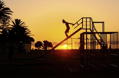
While walking on the promenade a couple of days ago I chanced upon a sight and had to take some photos. I liked the feelings of fun and freedom, with the beautiful warm colors of the sunset. Unfortunately shortly after the children left.

These 4 photos are essentially the best but each one has got something that irks me and something I like. I don't like how the girls are lost in the railings in some, I don't like how you can't see the one face in profile, in one photo they are laughing, in one the girl is sliding down, etc.

Please help me select the "keeper" among these....

1.
DSC_6407.jpg
I like that both girls are in the picture and they are laughing and that the Sun is in the right place, but they are lost in the railings.

2.
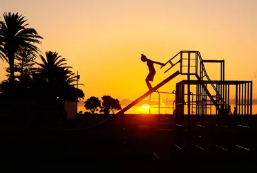
DSC_6409.jpg
I like the feeling of anticipation but prefer the ones where the girls are laughing and both in the photo, also the sun is in the wrong place.

3.
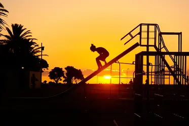
DSC_6410.jpg
Nice expression, but would have preferred it the girls were both in the photo...

4.
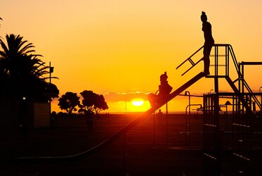
DSC_6413.jpg
I like the action but the one girl does not have her face in profile, and I prefer where they are laughing.
 
#2 for me - I like the connection of the girl to the hand rails. Sense of anticipation.
Really crisp silhouette - stands out cleanly from the equipment.
 
I agree about #2, but I think they all include too much in the frame. I'd crop in tighter so the girl and rail are bigger in the final image.
 
#2 for me too. Has more emotion. Nice silhouette by the way.
 
Interesting! Frame 1 and Frame 3 BOTH have people silhouetted in from of the restroom building on the left: in #1 the silhouetted person is a kid, in #3 it's a grown man, looking maybe a bit creepy...In #3 I would clone out the man's silhouette AND clone out the light post. The silhouetted people other than the kid or kids on the slide are part of the image too.

Frame #2 has the best posture for the single girl..and that's a very strong contender, as-shown.

My vote is #3, as-shown. Cloning out that light pole would really strengthen the silhouettes of the kids on the slide. #4 is a no-go compared to the others. That doggone light pole needs to be cloned out on all them, ASAP. Shots 2 and 3 have those fantastic palm trees on the lft edge, very strong, beautiful elements, and then the doggone pole kills the beautful frame-containing edge of the palm trees.

I think the key is that I am evaluating these in their As-Shown state...as KenC noted, cropping these could dramatically improve them. The other stuff in the frames, as-shown, is pulling away from the central focus a bit. The people silhouetted against the restroom building 1) create unease or 2)reinforced the idea of other kids being there.
 
I looked at Frame #2 in PS, and cloned out the light pole and lamp fixture from the restroom building and one of the beach-area light posts, and the top of the lamp just above the slide, and also cloned out a tiny speck that I am gonna say might have been a distant seagull. I then did a micro-sized curves lift, the tiniest one, to show the distant peoples' heads on the skyline a bit more, and to lift the sunlighted area a teensy tiny bit. I found it very hard to crop off any from the side of the play structure without it looking obviously cropped, reinforcing the rightness of your original 66mm focal length choice all the way! I cropped off maybe two millimeters of the far right edge, but could not satisfactorily find a crop-in that cut off the basic outline of the structure.

DSC_6409_edit 4.jpg
 
Last edited:
Derrel, Thank you. I did in deed play around with cropping. (FWIW The photos are already cropped, and some of the palm trees lost with that) - and also found that cropping more on the left removed the space into which the girls on the slide needed to move, and from the right it destroyed the play park. Cropping from the bottom or top created a panorama that I didn't think suited the scene. In fact I have a feeling that a more square crop would have been something interesting to play with but the only way to do that would be by adding negative space and that didn't work either.

However for me one of the most important results of the cropping was to make the slide seem taller, the girls "far up in the sky" - and effect that was lost when there was a lot of headroom

About the cloning out of the unsuitable elements, thank you, I fully agree but if you're going to do that kind of effort let me know and I'll share the NEF with you.

I actually wanted to move further left and get a lower angle but the girls left :-/ (also the restroom blocked out more of the palm trees)

Personally I feel the color in your edit is too washed out, but that may be just the way it looks on my crappy screen. I do think that the color in my own are just a smidge too vibrant... Getting the color right is always the hardest part for me in sunset photos.

I really wanted nr 4 to be the winner because of the action, but it doesn't work.

Thank you!
 
Meh, I take back what I said about your color looking too washed out, I can't see the difference any more (viewing carefully on another monitor now)
 

Most reactions

Back
Top