Color check needed for this photo please.

Lightsped

TPF Noob!
Joined
Jul 8, 2013
Messages
176
Reaction score
12
Location
Acworth, Georgia
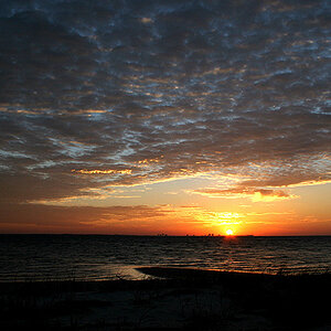
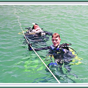
Made this photo, and when viewed on the school's TV it is very very over saturated. Extremely bright reds and blues. Checked the photo on a few Android and Iphones and photo looked good. Don't have many monitors to check the photo.

How does photo look color-wise? Is it over saturated? Any adjustments needed?
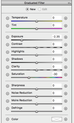
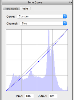
 

Attachments

  • DSC_8497.jpg
    DSC_8497.jpg
    1.3 MB · Views: 257
I have looked at it in lightroom and the colour is off in the yellow a bit. If you look at the pledge banners and flag on the wall I am guessing they are supposed to be white. Once I adjusted the colour it looks better and colours don't look to over saturated but they do look as if they have been adjusted.
I desaturated in lightroom -20.

I can post my results if you like.

Edit: The colour cast is most likely due to the sodium vapour lights that were in the gym.
 
Last edited:
That's what I was thinking, the back wall looks yellowish to the left and more off-white to the right. Weirdo lighting, and uneven!

The reds and blues look fine, but then I don't know what the red shirts actually look like to know how accurate the color is. They look rather orangeish red but maybe they're close to that shade. I noticed the red stripes in the flag look a bit orangey red so you may need to adjust overall for that yellow light.

The photo looks perfectly straight, and I noticed doing sports there are often a lot of lines and posts and signs to contend with. I'd think about a very slight crop along the right side where you're catching the edge of a poster; that could be cropped without losing any part of the subjects.
 
Hope it's OK that I gave it a go. Here's what looks good on my, non calibrated, screen:
V2.jpg


(I had to lower the quality to be able get the file size small enough to upload)
 
I think part of the problem you were having is that the floor is adding a huge colour bias.
Can you copy the pic and then crop out some of the floor in front and see what that does
 
I see white balance is a touch too warm but it does not appear over saturated on my iPhone 11 screen.
 
There needs to be an in-between from the original and @stk 's edit. The edit is way too blue and darkened.

IMHO, it looks like it just needs WB attention and minor curves adjustment.


I played around and I'd be somewhere around here:

upload_2019-12-18_9-0-9.png
upload_2019-12-18_9-0-37.png


playing around with some free photo editor, the orange is what really needs messing with. If I had LR here, I'd probably use gradient filters on the bottom two rows to fight the blue cast up from the floor, and the top row from the ambient lighting, to balance between the two.

I'm still not happy with my edit, but I'm working with free software and a jpg here :) But I do think it's closer.
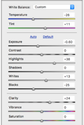
 
I think part of the problem you were having is that the floor is adding a huge colour bias.
Can you copy the pic and then crop out some of the floor in front and see what that does
The refraction of color off the floor from the red/orange tone Gis is what is doing the damage.
The refraction of the red at the bottom is interfering with the blue through stray light.
That's why they are always in clash to each other.
Now given that you have this to work with, the color adjustments made so far look good, but if the floor can be de-saturated a bit whilst leaving the color adjustment on the wall, you should have it made.
 
@Lightsped : I did not see where you have "OKayed" your photos to be edited. You can change it in your personal settings.

Also; different displays will render colors and contrast differently. I usually recommend that you calibrate your own display, and then anyone else's display will just show it right or wrong, whichever.
 
The issue is likely the TV monitors are cranked up from out of the box settings which tends to oversaturate everything.

However, there is a colour balance bias in the original you posted. I would suggest the placement of a large WB card in your first short so it can be sampled in post for your edits.

I have done a few tweaks if you care to see them, just let me know and I will post it and the screen captures of the settings.
 
Sure I'd like to see them.

Thanks to everyone else for their edits and tips. Always good to learn something on TPF!
 
Here you go, I added a grad filter to the blue floor to knock it back and put the emphasis on the subjects:

DSC_8497_1400px_edit.jpg
 

Attachments

  • Adjustments.png
    Adjustments.png
    89 KB · Views: 142
  • Grad_Filter.png
    Grad_Filter.png
    105.1 KB · Views: 162
  • Tone_Curve_Blue.png
    Tone_Curve_Blue.png
    29.6 KB · Views: 153
@JBPhotog It's missing way too much orange channel. It also feels really dark now -- i very much dislike the vignetting on the floor. It's also got a green tint to it if you look at the yellows, and feels too cool on the WB.

If I take your edit, increase the orange saturation by +50, bump the shadows up, warm the WB, and move the tint to the red a bit, IMHO, it looks a lot better.

But I still dislike the gradient on the floor.
 
Last edited:
That floor is really kicking your colour balance off. Not only does it dominate the colour you see, (the eye does a sort of *auto WB* that's affected by the blue), but it seems that it also kicks the auto WB off as it makes the rest of the image a little too yellow to compensate:

ex01.jpg

If you can pull back the floor colour I think that you'll achieve a more convincing colour balance with the auto tools, or get the colour absolutely correct as the very first step before any contrast or saturation adjustments.

ex02.jpg
 

Most reactions

Back
Top