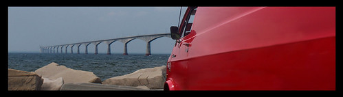
An interesting image, combining blue and red complementing colours.
To me it appears not well balanced though.without the car it would be ok the way it is cropped now. But the car is too heavy (huge area) to occupy half of the image, whereas the other half is occupied by the fragile bridge. just IMHO of course. I would not remove the car, but give it maybe less space.
Unfortunately the image is rather small ... I think if it was displayed here at twice the size it would greatly benefit.



![[No title]](/data/xfmg/thumbnail/34/34073-71bff52a53b8313ff2bcccab6b05f9b8.jpg?1734164509)
![[No title]](/data/xfmg/thumbnail/42/42277-63576745f84be96df79b94ca0f49e00b.jpg?1734176687)
![[No title]](/data/xfmg/thumbnail/42/42279-f60778d39180ee6cd87fc84a15559b96.jpg?1734176692)