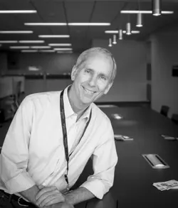
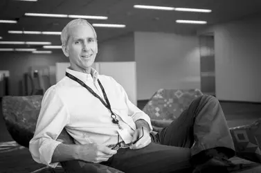
The one on the left has like, 22 ceiling lights that are hugely distracting. Then 17 or so lights in the second are a little bit less distracting. The one with the sink in the background is a bit better. All in all these seem cluttered in the backgrounds, which compete with the man for attention. Not sure exactly what the client wants, but perhaps a more-telephoto look would narrow the background angle of view, yet still provide a big foreground person. I think the B&W conversions look nice though, and the guy looks friendly and at east enough.
+1
If you've got to shoot in their space with available light and they won't let you pose against a wall, think composition. For instance, the problem with #1 and #2 involves a basic composition 101 rule: the viewer's eye is drawn to light or bright spots. So that might be helpful in having a conversation with them...they can insist that it not be "studio" and it "looks natural" but you can point out that the basic rules of decent photography insist that we eliminate background and foreground clutter (not poles or wires coming out of someone's head) and eliminate glare or hot spots, and avoid bright or white spots that pull eyes away from the subject.
Also, a couple of other corporate portrait tips for you.
1. Be clear about how they intend to use these. Put 'em on a website (in which case you're going to naturally end up with a lower quality/grainy result regardless of what you shoot b/c they'll need to reduce the size)? And if it goes on a website, you'll want to get a sense of it (b/c B&W might not work in the context and layout of the site or your photos may be too dark against a very light and bright interface). Or put in an annual report? Or on a poster with an org chart?
2. Some degree of similarity in dress and appearance. You don't want some people posing casually ("hey, here I am hanging out at my place of work") and some show up with suit and tie. They don't all need to be in a uniform (all wearing a light colored polo) but they should all look like they work in the same place and the poses should have the same feel (i.e.: not 2-3 who are formal, 4-6 who are casual, 2-3 who are having fun or look spontaneous, 2-3 who appear to be working). Use the photo style to suggest "this is a group--these aren't just a random collection of individuals but they have at least one thing in common--they all work together!"
3. Find out who gets selection or veto power on the shots. In some companies, it's the Communication Director/PR. But in others, the company lets individuals veto a shot ("I look fat in that one!"). In which case it gets replaced by a phone camera shot of them against a bulletin board (and then your collection of work looks haphazard and a mishmash. So if individuals get to veto, then take a couple of shots and then pop 'em up on a laptop and let them approve so at least you know that won't problem with the final results.
4. Identify something for subjects to hold. New models who are uncomfortable doing this typically don't know what to do with their hands. Give 'em something to put in their hands (pen, cellphone, report, coffee mug).
5. Look for things to include in the photos that are iconic to the company. Did a shoot for EDS many years ago. Their big thing was the Eagle. So I looked for ways to sneak an eagle in to the photos. In one case, it was the corporate symbol (the eagle) on a mug. In another, it was an EDS eagle poster in the background. In another, it was a statue of an eagle on one guy's desk. Someone else was a fan of the Philadelphia Eagles so we had a piece of fan gear (I think a pen if I remember correctly) in his pocket. But what you don't do is to have everyone holding the same mug--that looks staged (or has people joking about how they all got a cold by sharing the same mug to drink out of). But if there's something iconic or symbolic to the company, prior to the shoot, ask people to bring an example of that (be it a mug, glass, T-shirt, poster, pen, hat, whatever) and see if you can naturally fit it in.
