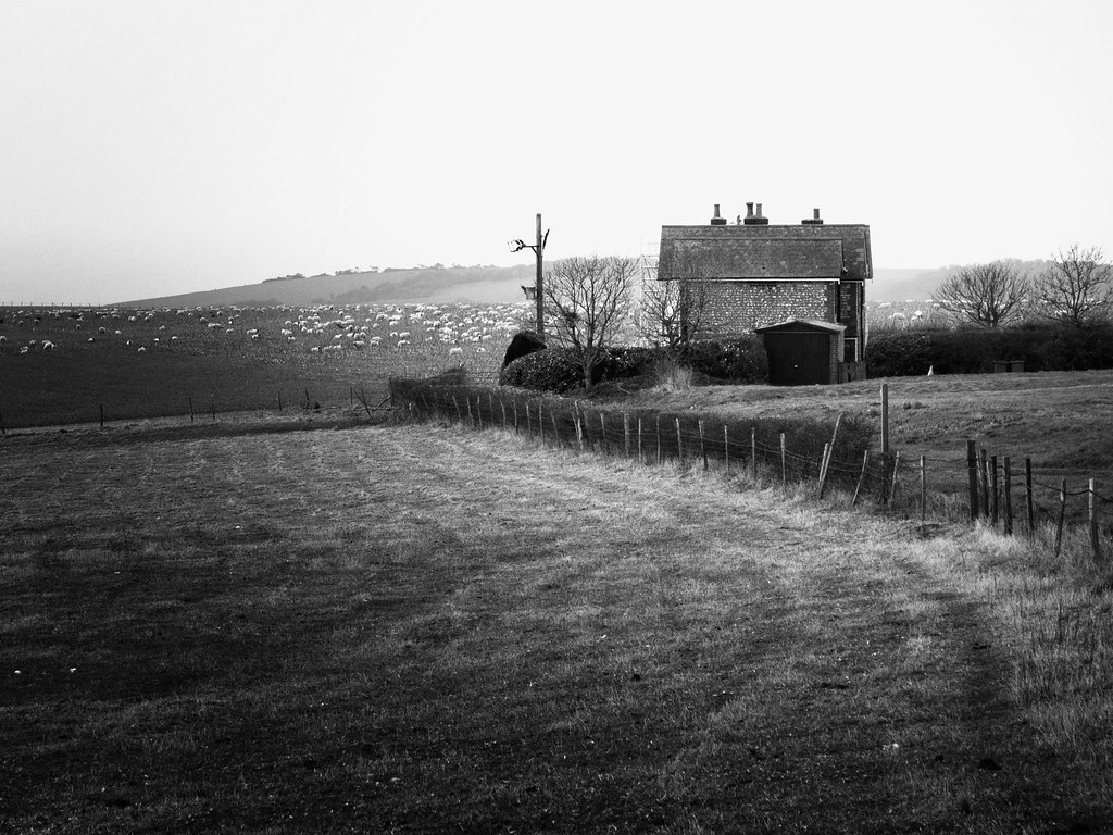
Interesting choice. There appears to be a thoroughly dodged region, or possibly a thoroughly burned area surrounding the region.
I find myself puzzled and interested in why you chose to so severely emphasize what is clearly already the main area of interest.
The composition, interestingly, *I* find to be the least interesting thing. Placing the building precisely on a 1/3x1/3 line feels trite. The area to the right of the fence feels cramped and out of balance relative to the foreground pasture area. The dodging emphasizes this sense of off-balance-ness.
If you're going for a weird off-kilter slightly creepy feeling, I think you need to push a bit harder. Dodge/burn more, and crop a little tighter to increase the sense of cramped unbalance. If you're going for a mellow bucolic country feeling, open up the right side of the frame and back off the extreme tonal range.




 Do settings need to be adjusted when using an adapted lens?




![[No title]](/data/xfmg/thumbnail/36/36601-26ec0a53712c5470af53be9652811a6e.jpg?1734169054)


![[No title]](/data/xfmg/thumbnail/32/32930-09414fc020c2a60a456ff59a05c5ef8f.jpg?1734162706)